If there’s one thing that becomes apparent when you step inside my home, it’s that I have a deep and abiding love for vintage art. I love the warmth, texture, personality and lived-in feeling vintage art instantly adds to a home. And one of my favorite ways to display vintage art is in a gallery wall. Today I’m going to share my foolproof method for building a gallery wall with vintage art prints, how find my frames, order my prints with confidence, and make inexpensive art prints look like originals. So let’s get started!
Collect your frames.
The first step is to collect your frames. I almost entirely buy my frames at Thrift and antique stores, I love the patina and character you get with older frames and find that they match the vintage art much better. It also saves so much money. Gallery walls can get expensive because there are just so many pieces, so if you can find your frames for a deal it really helps.
I don’t like my frames to be too matchy-matchy, so I usually look for a mix of gold/brass, wood and painted frames. And I always collect a variety of sizes. If you measure your space before shopping you will usually have an idea of how many frames you need, but it doesn’t hurt to collect a few extra. Some frames might need to be fixed up a bit, so keep an open mind when searching.
See how I give thrifted frames a facelift right here.
Measure your space.
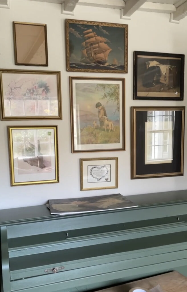
Once you’ve collected a bunch of great frames it’s time to lay them out. I like to measure my space and then mark that space out on the floor and arrange the frames until I get a combination I like, before putting any holes in the wall. Once it looks good, I hang the frames (yes, even with the goofy thrift store art in them) to make sure the frames fit in my space before I order the art. Then I make notes of each size of frame.
Mock up the gallery wall.
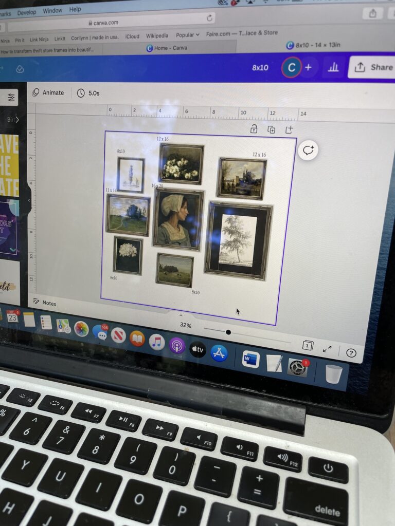
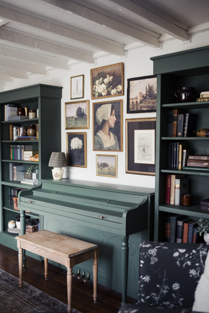
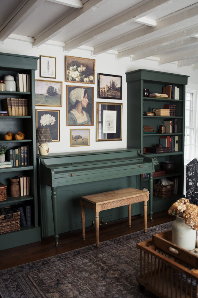
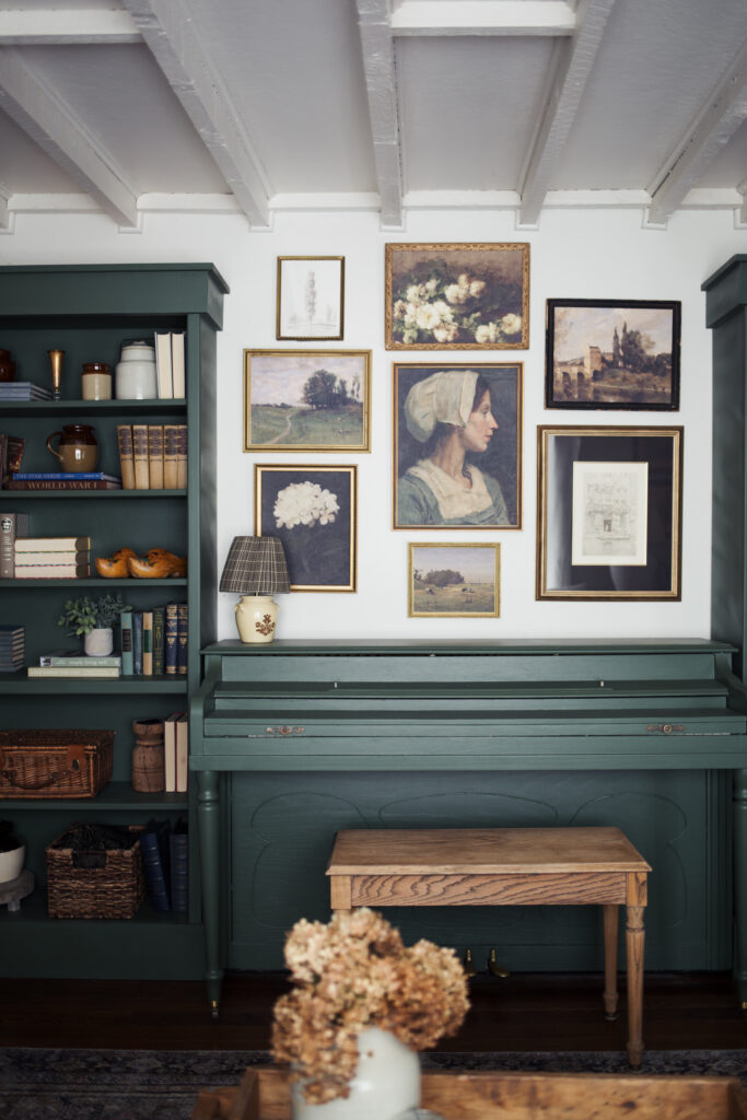
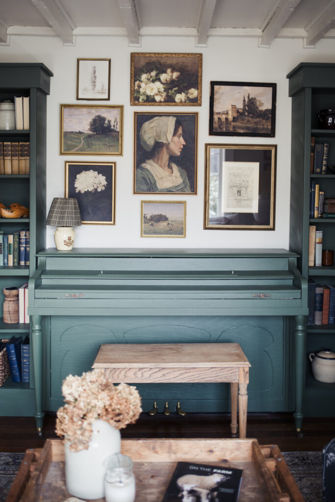
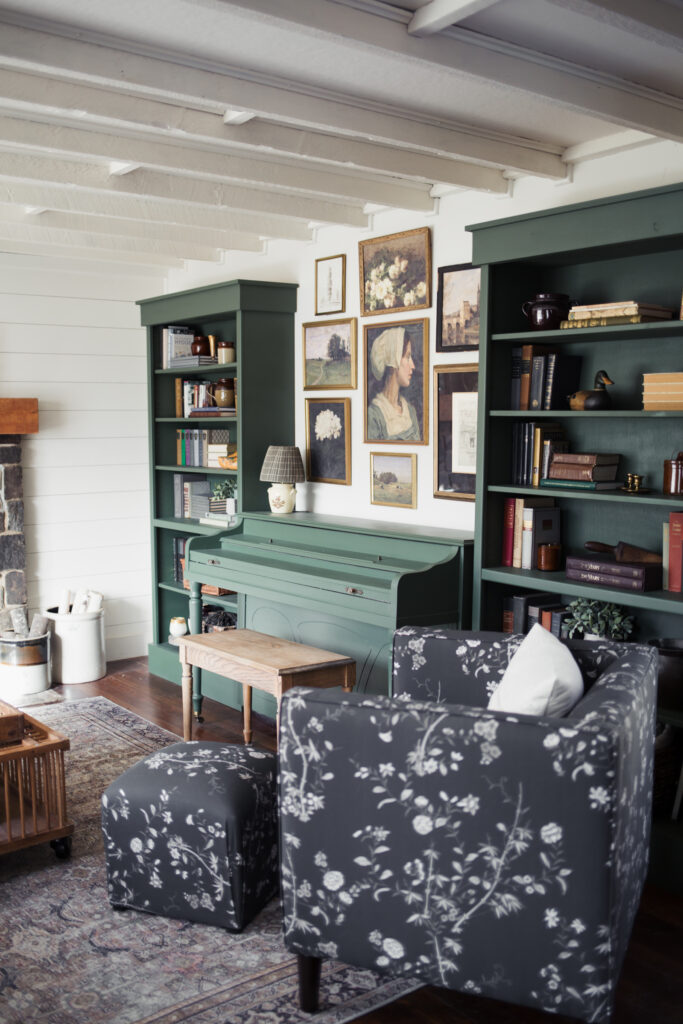
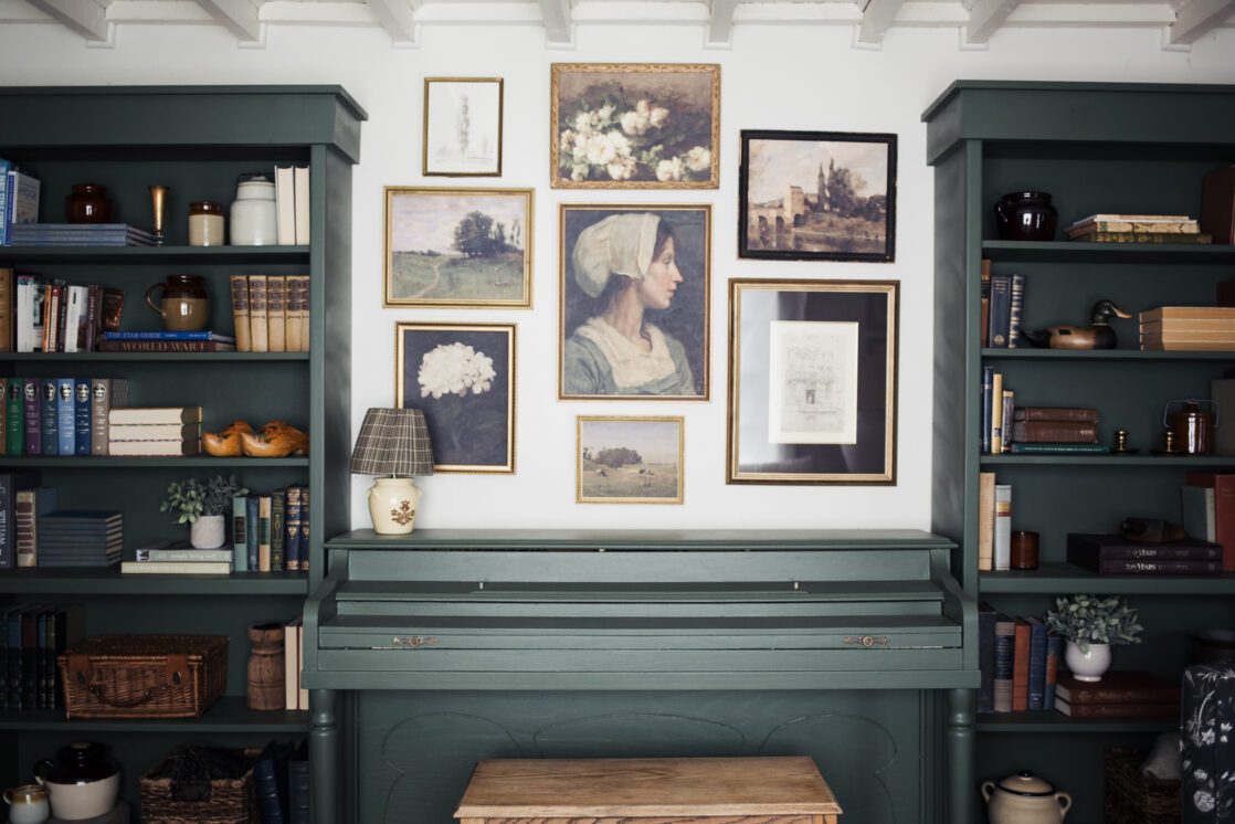
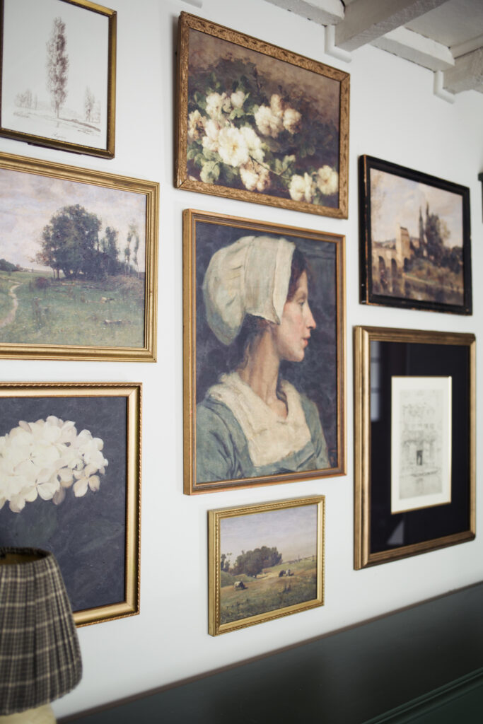
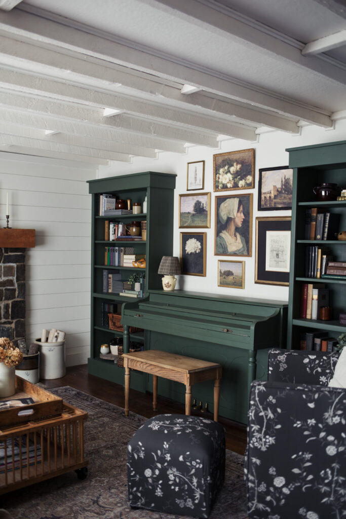
The next thing I do is create a mock-up of the gallery wall using Canva on my computer (or you can do it on your phone via the app). I grab screenshots of different art prints I’m considering and arrange them until I’m happy and everything feels balanced. This is the easiest way that I’ve found to choose art and avoid ordering a bunch of prints that don’t really go well together. I usually start with a “hero” piece. A painting I know I want to include and build it out from there. This gallery wall was built around our “Peasant Woman in a Cap” print, and I love having the display revolve around her.
Order your prints.
Once I have all the art selected, it’s time to order the prints. All of the art in this gallery wall came from my print shop, except for the vintage Italian sketch I found in an antique shop. We offer both digital and printed options. If you buy the digital art print you can have it printed at your local Staples or Walgreens, or you can order prints from MPix.
Prep your art.
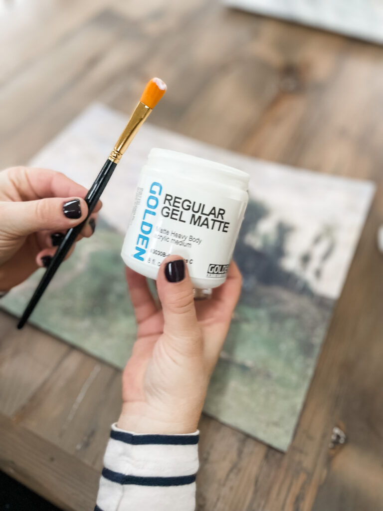
Once my art prints have arrived I add a gel medium to them, this makes it possible to hang the art without glass while protecting it, and also gives it texture and makes it look like original art instead of prints. I have a tutorial here, showing how I add the gel medium.
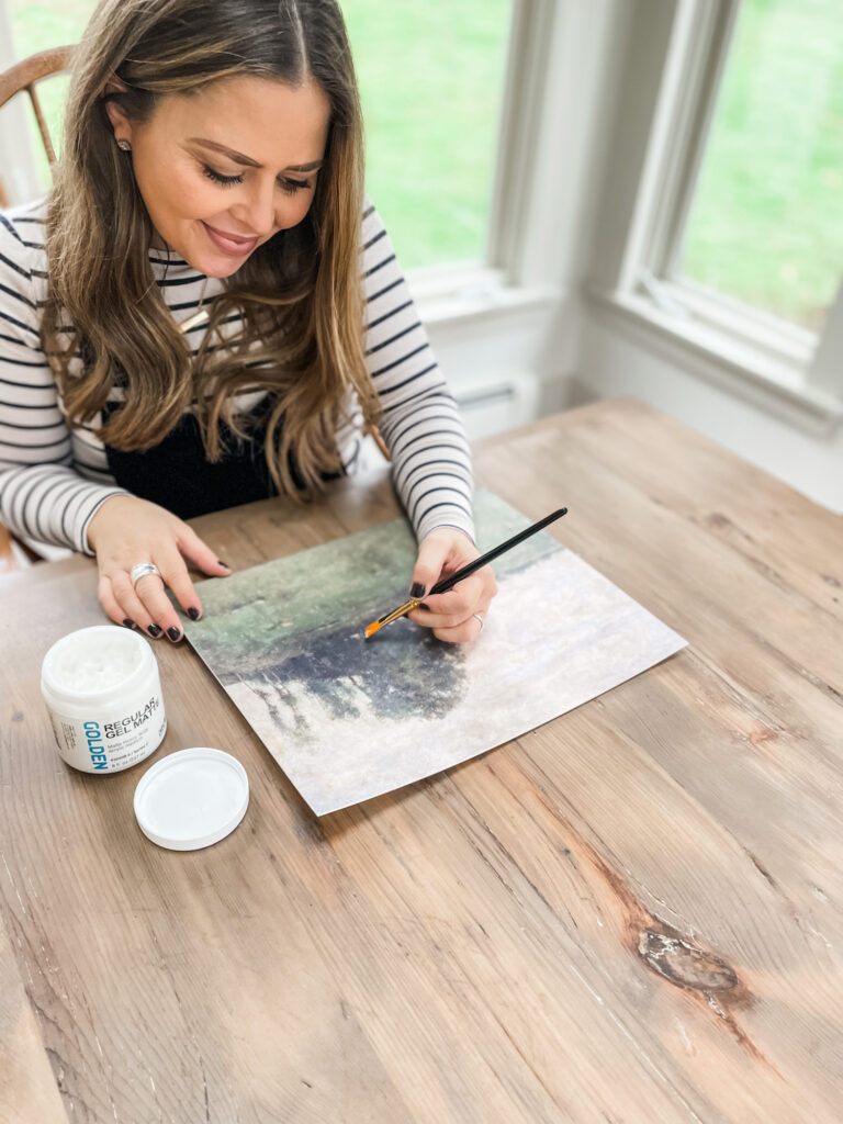
Once the gel medium is dry, I cut them down to fit the frames, mount them and then hang them all back up. And I have a beautiful vintage art gallery wall!
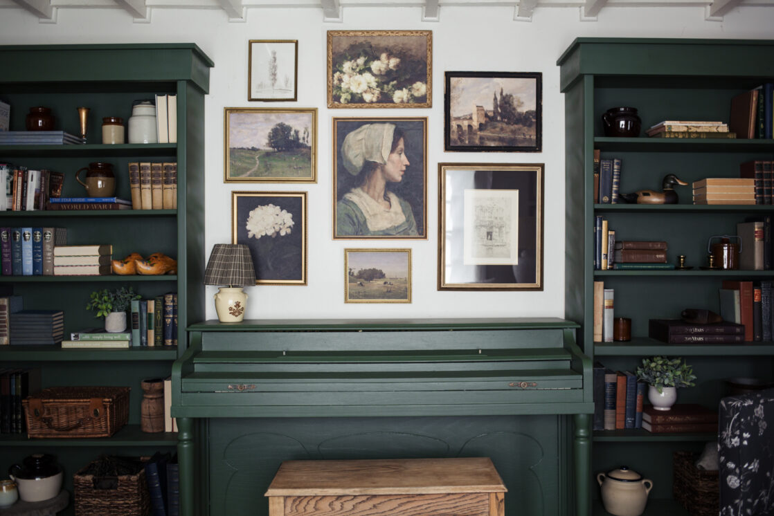
Prints in this gallery wall:
Hydrangea print. (coming soon!)
Mother and Daughter by a Bridge print.
Italian sketch. (found in an antique shop.)
See my tips and tricks for styling bookshelves here.
Just curious what the paint color of the piano and shelving are? Thanks!
Hi, the color is Deepwoods by Benjamin Moore