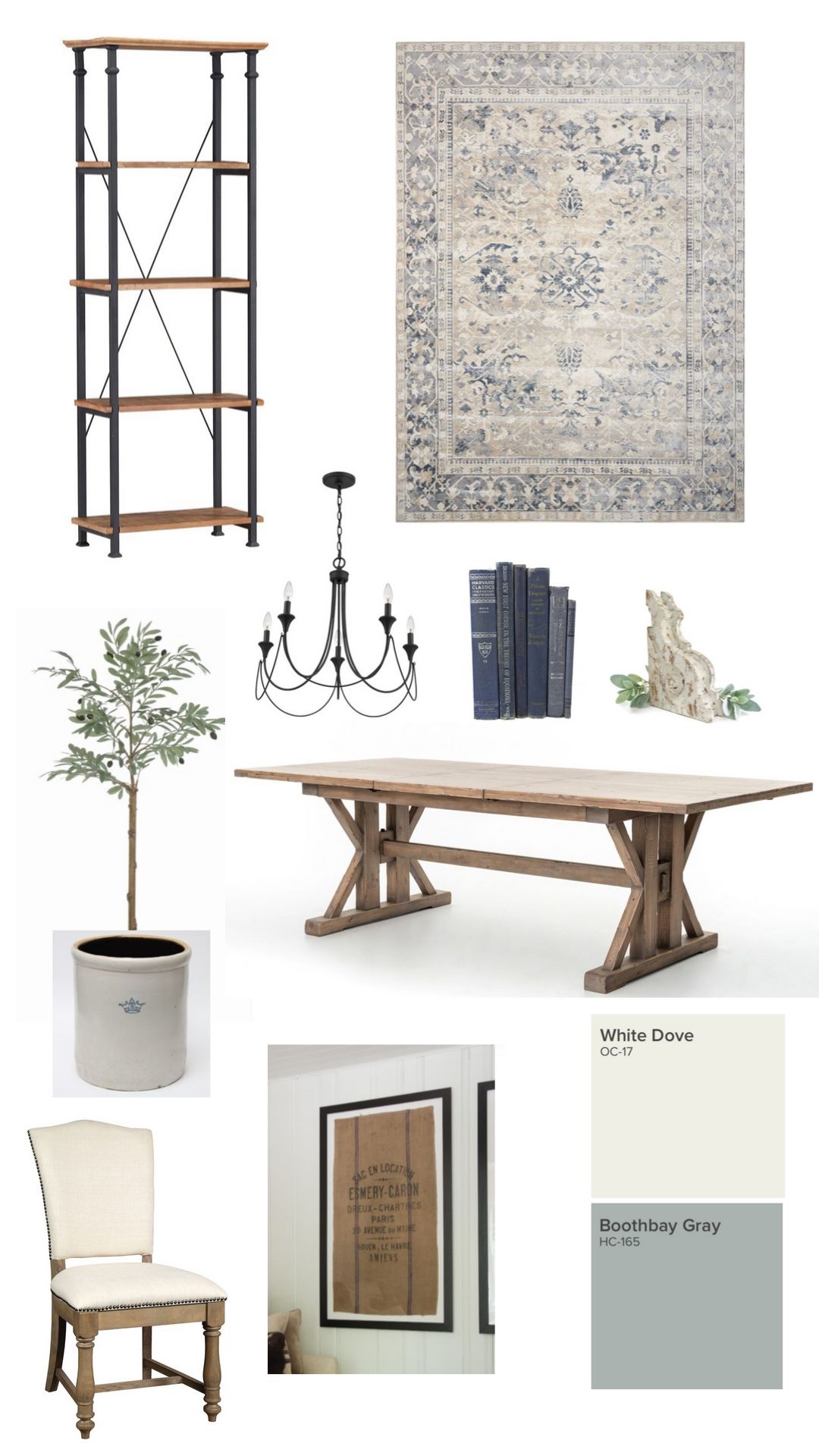
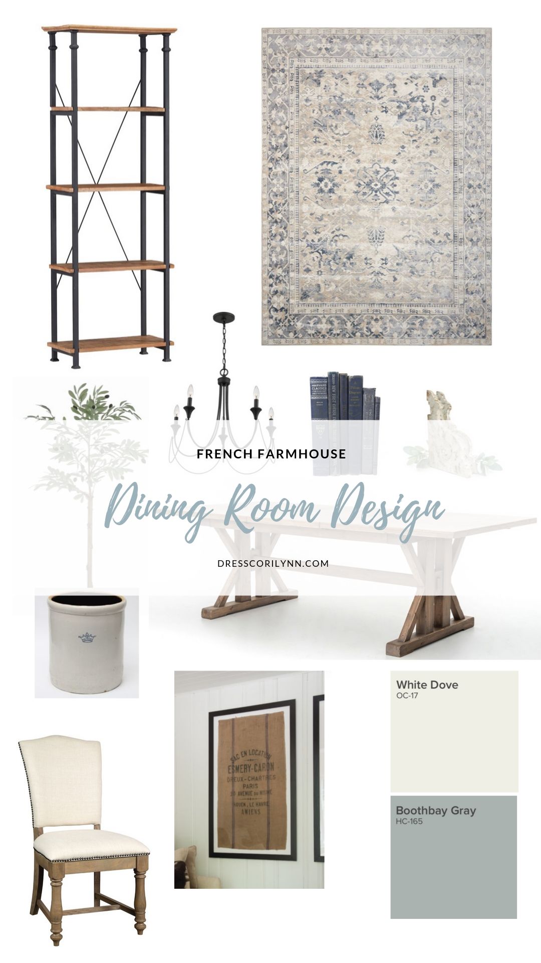
table. chair. bookshelf. rug. chandelier. crock. olive tree. corbel.
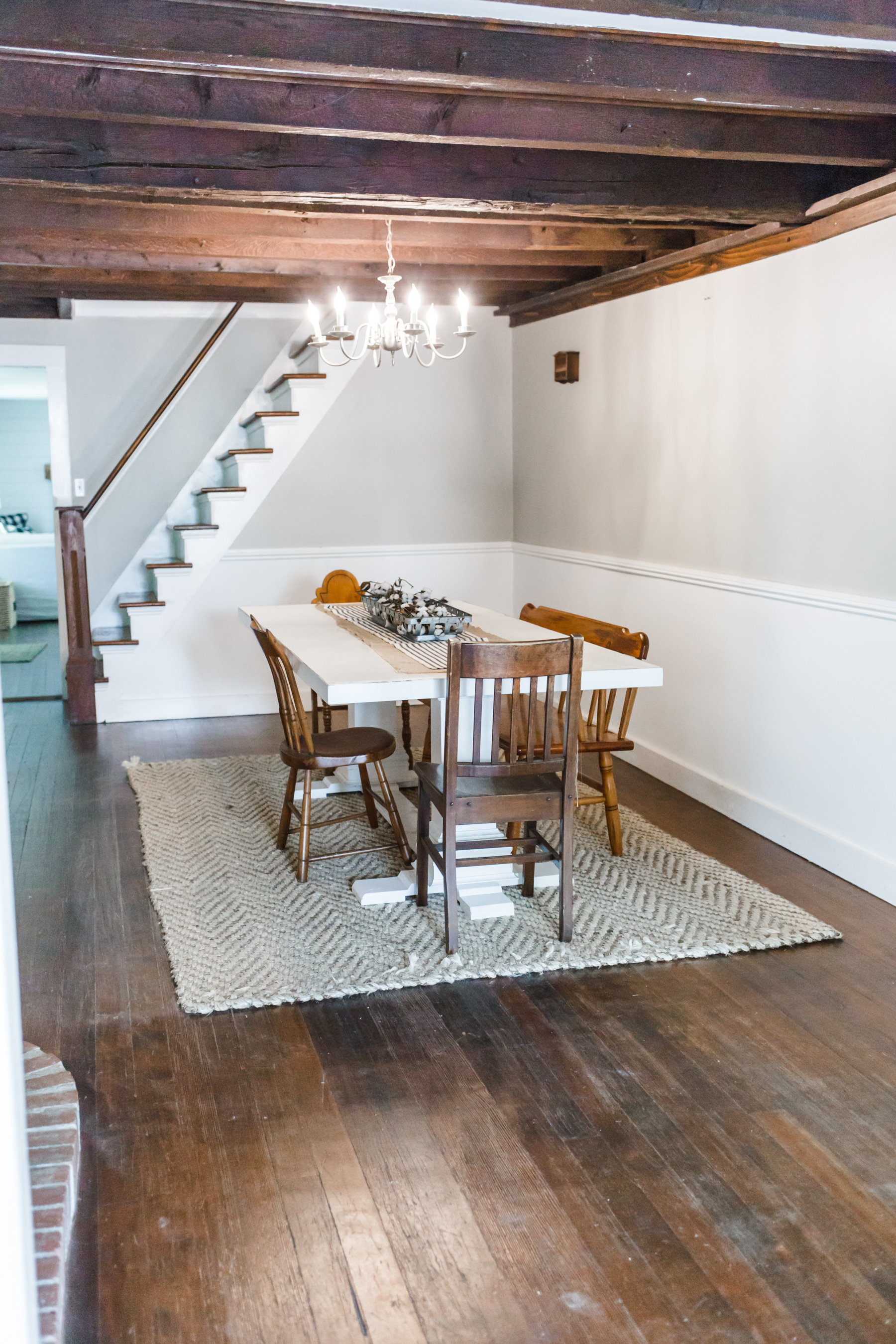
If you follow me on instagram (and watch my stories) then you know I’ve been working on a new dining room design for the last couple months. I’m actually really close to being done, hopefully by the end of the week. So I thought today it would be fun to share the design mood board I created for the space before I got started. And also a before of the space I am working with.
before:
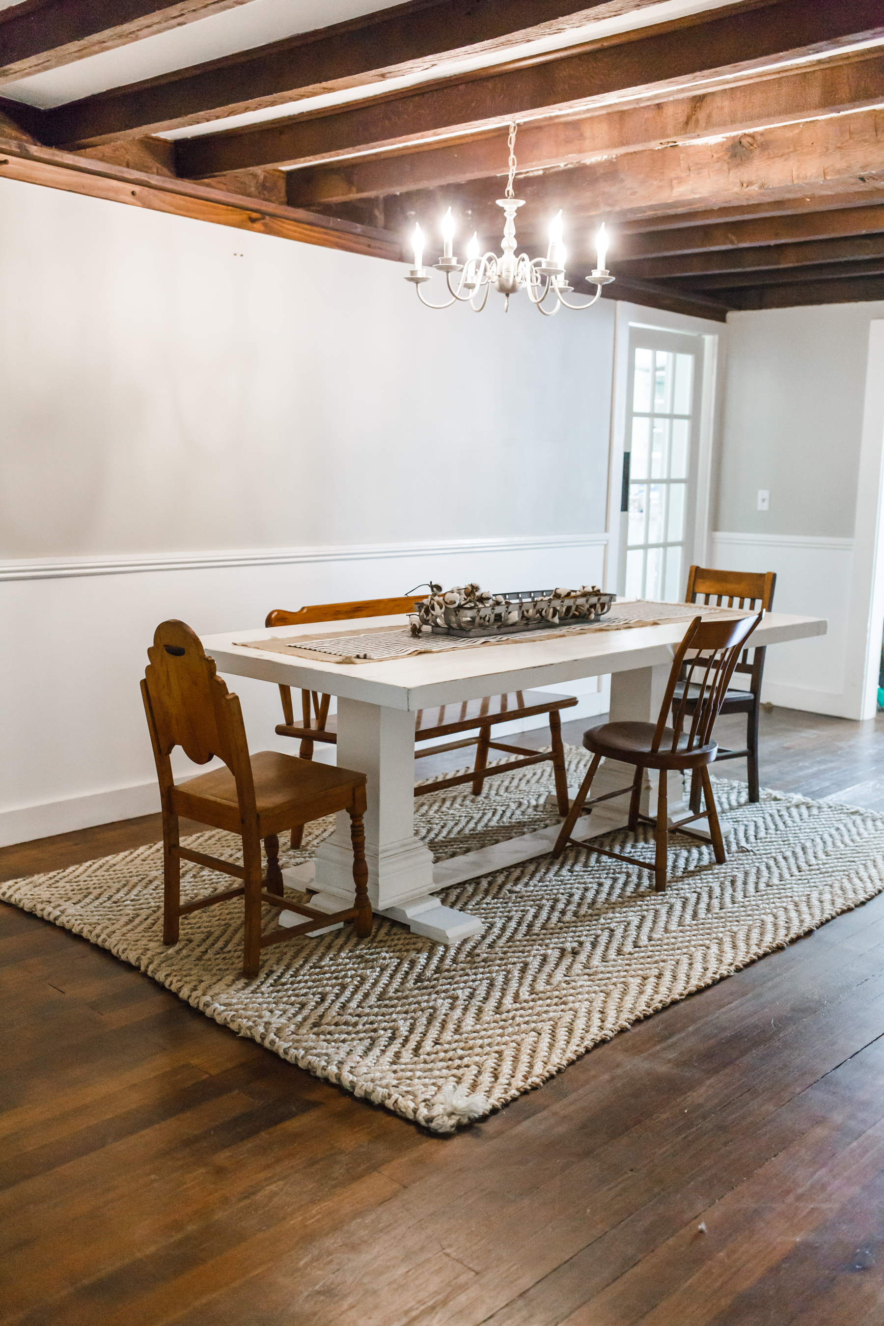
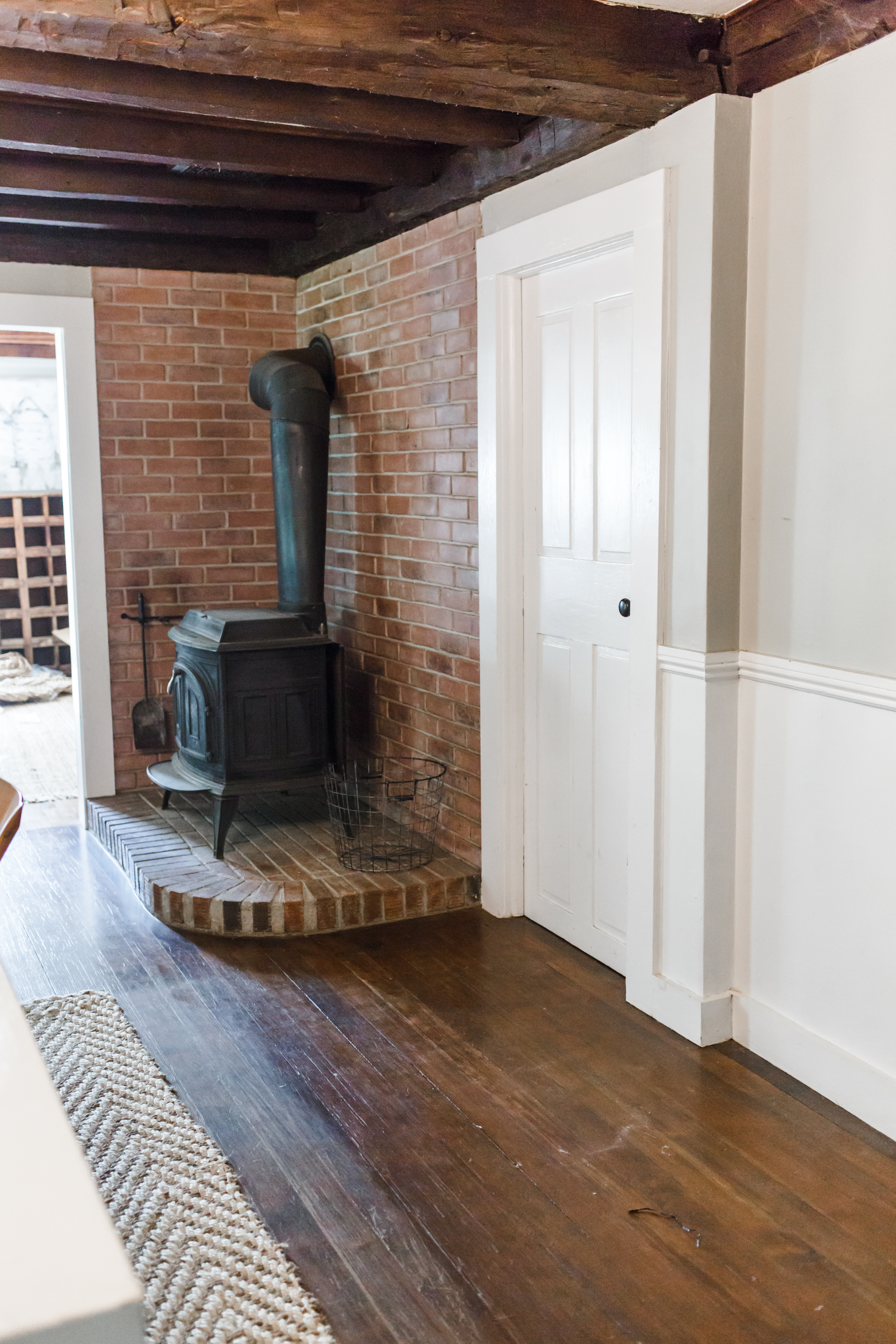
I started doing this last year before our bathroom remodel, and now I don’t even begin a room makeover without first creating a mood board. It just makes it so much easier to see how everything will come together visually, and it helps keep me on track during the process. It’s so easy to get distracted by every shiny object when you’re shopping (especially for someone like me), so having a design plan really helps keep me on track and helps me avoid making impulse purchases for our home that I later regret.
This is ironically very similar to a lot of the way I approach building a wardrobe… I’m seeing a theme here, haha. To read more about my approach to that, click here.
This space was inspired completely by our time in Provence last summer. So much of the French lifestyle revolves around food, and so I really wanted to bring that into our home in our formal dining room. I wanted reclaimed woods and some soft gray blues, lots of white and a few pops of black. I am also incorporating some large French grain sacks I purchased at the antique market in L’Isle-sur-la-Sorgue last August, and they were really the first pieces that inspired the space.
I chose this tuscan spring dining table from Raymour and Flanigan, and it is exactly the feel I was going for. It’s honestly such a beautiful piece, made of genuine reclaimed wood, with lots of character and such a beautiful color. I knew I wanted the rug to really bring out that soft grayish blue that I always associate with the French farmhouse, and this beautiful Malta rug from Raymour and Flanigan is exactly what I was going for. It’s even prettier in person, the colors are so gorgeous.
Most of the walls in our house are white (which I love and works well with our dark beams) but I wanted to add a little bit of drama to this space so I decided to do a two-toned wall and went with Benjamin Moore Boothbay gray on the bottom (which is the most gorgeous grayish blue color and works perfectly with the rug) and a soft white on the top. I love to incorporate found items into any space I design, because they tell a story and are completely unique, so I’ll be creating vignettes and incorporating some of my favorite antiques into the room, I can’t wait to show you how. I’m also doing a German shmear on the brick around our wood stove to lighten it up and give it a more European feel, which I was very nervous to do, but so far I am loving how it is turning out.
I should have the room finished by the end of the week, and I cannot wait to show you how it turns out.
Do you create design boards before you decorate a space?
*This post was created in partnership with Raymour and Flanigan.


