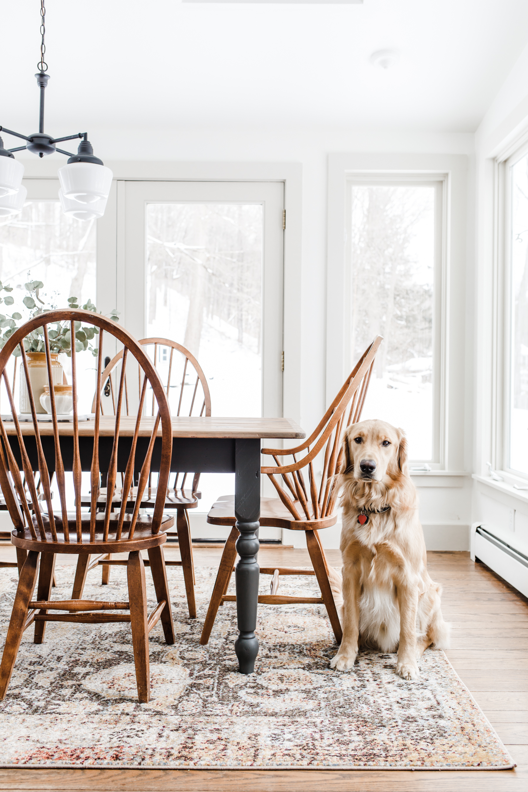
Today I am so excited to share our modern traditional cottage breakfast nook makeover! This was a really special project for me because my two teenage boys helped me with the entire project. From helping me pick-up and load the antique pine table I found on facebook marketplace, then helping me move it in and out of the house while I was refinishing it. To helping me rip out all the old window trim and then hang a fresh trim, they worked so hard and we made a lot of great memories. We also learned a lot while revamping this space and I am so excited to share it with you today!
How my home style has evolved over the last few years.
Like my closet, my home style has evolved quite a bit over the last few years, especially as I’ve really dug in and started discovering what I truly love, what works with our spaces, feels true to our families soul and also pays tribute to the history of our home. I’ve had a heck of a time defining this style by name. It’s kind of a marriage of modern traditional, English cottage, minimal shaker. None of those seem quite right, but it’s kind of a marriage of all of them, and it makes sense to me. I call it modern traditional cottage. (Yes, I made that up.)
So what is modern traditional cottage ? It’s traditional, a touch rustic, with an heirloom, handmade and collected feel. It’s got a foundation in traditional farmhouse style, with simple natural finishes, clean shaker inspired lines, and has subtle modern hints. It feels cozy, comfortable, warm and welcoming. And casual. To me, every space in my house will be a success when it feels like you can curl up and read a book or sit for hours in deep conversation.
So how did this play into our breakfast nook makeover? First let’s talk about what we were starting with in the space.
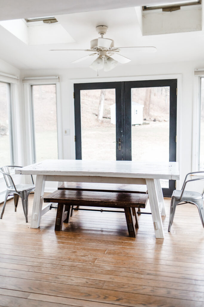
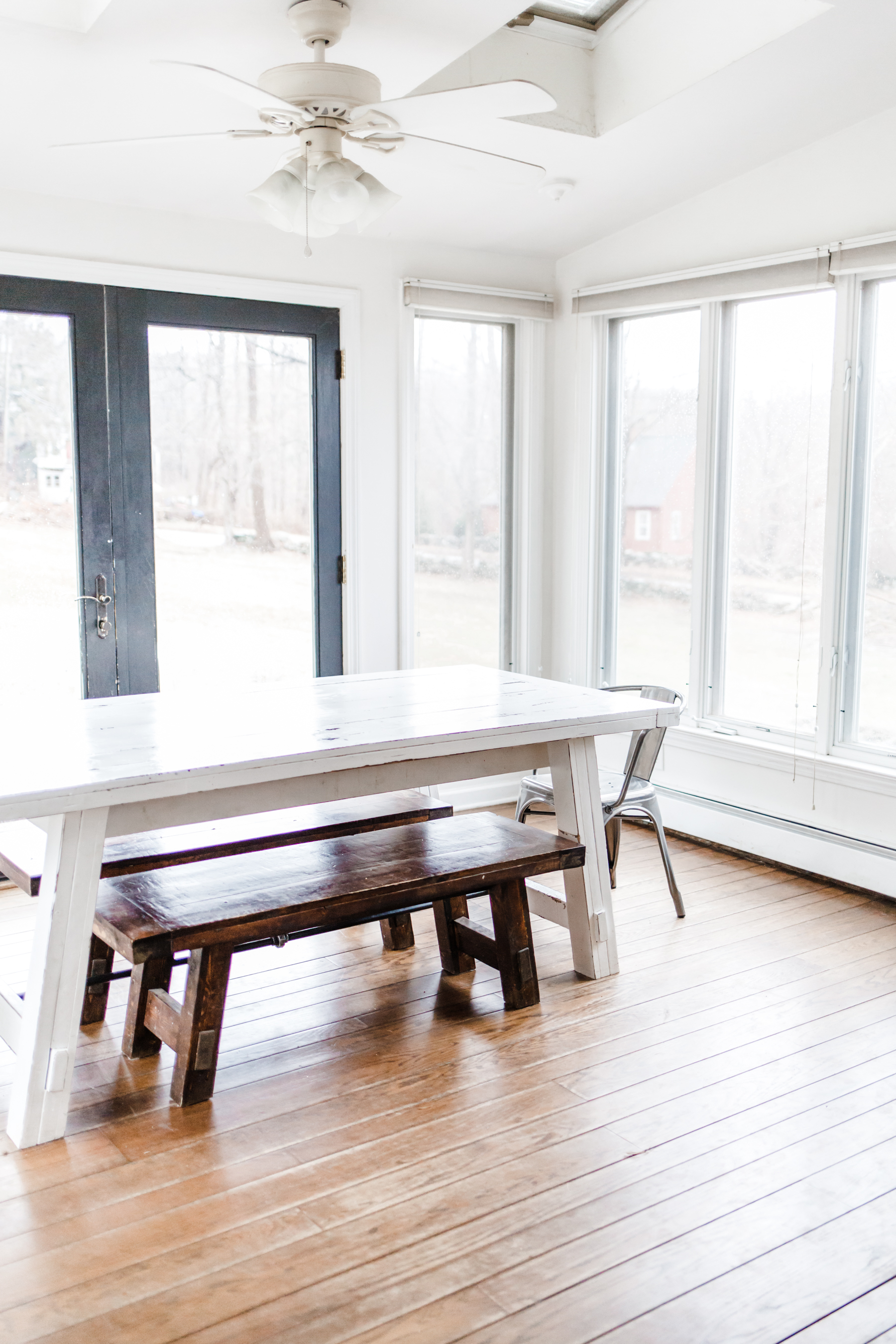
Before:
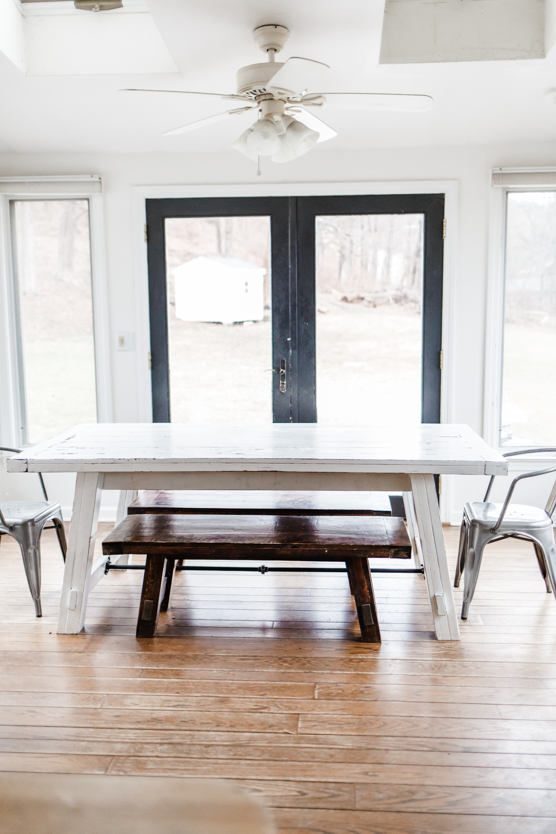
The breakfast nook and kitchen of our home were “remodeled” rather badly we estimate sometime in the late 90’s and when you put them next to the character of the rest of the home, these rooms have stuck out like a sore thumb since the day we moved in. The trim, light fixtures, windows. All of them felt wrong. The 90’s fan was so dingy I could never get it fully cleaned, and the old accordion blinds were an eye sore. The windows open out, so all the screens were on the inside, which made the light coming in feel dirty and badly filtered. The paint was faded and the wall around the skylights was never even painted.
When we moved in, we basically just put our farmhouse table in the space and then ignored it for the last few years. Partly because we had bigger fish to fry, and partly because I thought we would need to replace all the windows in here to improve the space since they were so different to the historic windows in the rest of our home. Then a few months ago I started thinking that maybe if I made some simple changes, I could totally transform this space without having to do a major renovation. I am so glad I was right.
First step was hunting down a new table. I knew I wanted an antique English cottage style kitchen table and that it needed to be a bit smaller for the space. Because we use our back French doors all the time to get out to the yard, having a table as long as our farm table really messed with the flow of the space. I hunted for weeks everyday on Facebook marketplace for a table before I found this one:
Table before:

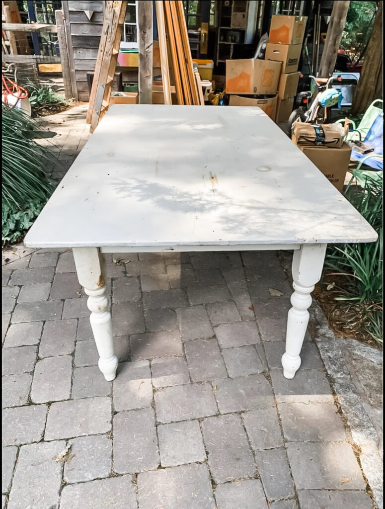
I knew this table would finish up beautifully, (after a lot of work) because it’s solid wood and had some really great distressing and patina buried under many layers and years of paint.
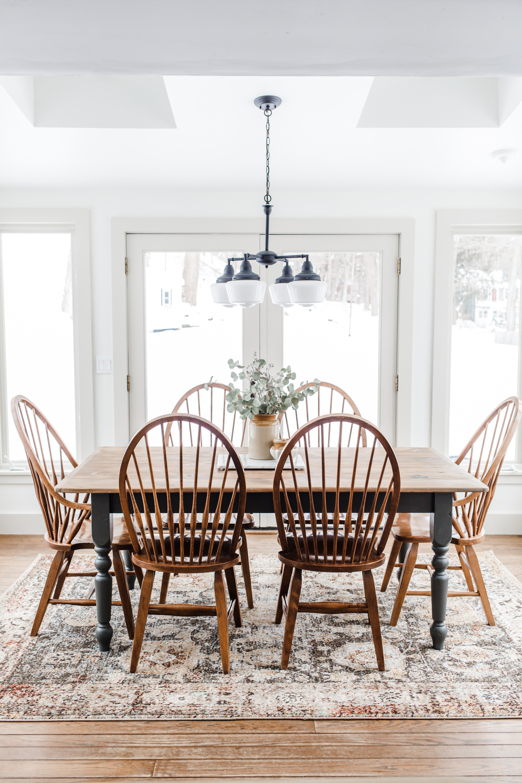
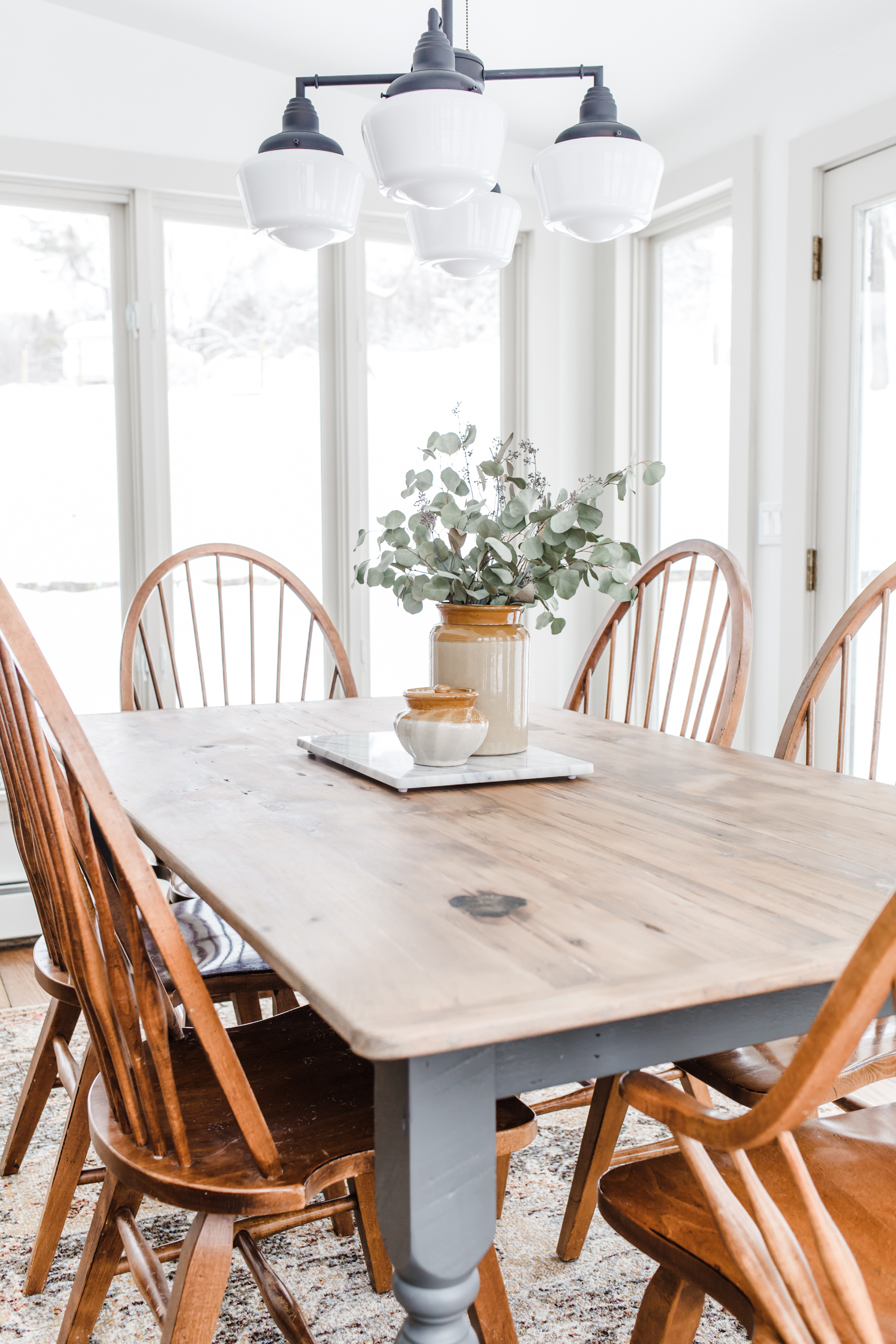
First step was to refinish the table, which I did by using a chemical stripper to get most of the paint off the top, and then sanding it down to raw wood and refinishing with a soft grayish-brown stain. Then I cleaned up and reinforced the legs of the table, and sprayed it my favorite deep charcoal gray Iron Mountain by Benjamin Moore. I sealed both the legs and top with this wax finishing paste (my favorite furniture finishing product). It turned out even better than I was hoping.
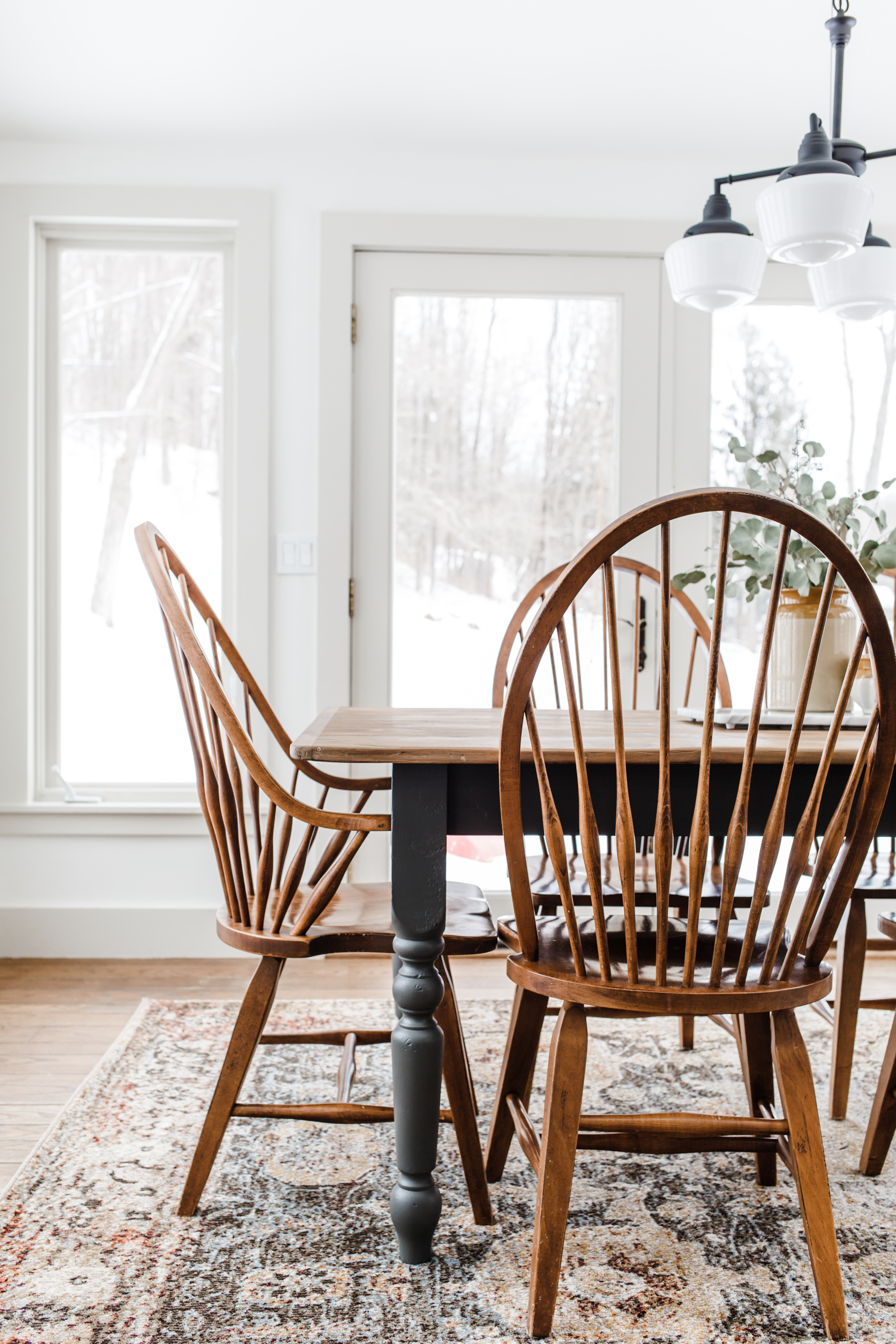
I knew I wanted to replace our benches with a set of modern classic Windsor chairs. This took a little more time and hunting on facebook marketplace (especially to find a set of six), but I finally found the perfect set that gave me just a hint of a nod in a modern direction.
Now we had the furniture figured out, it was time to get started on the space…
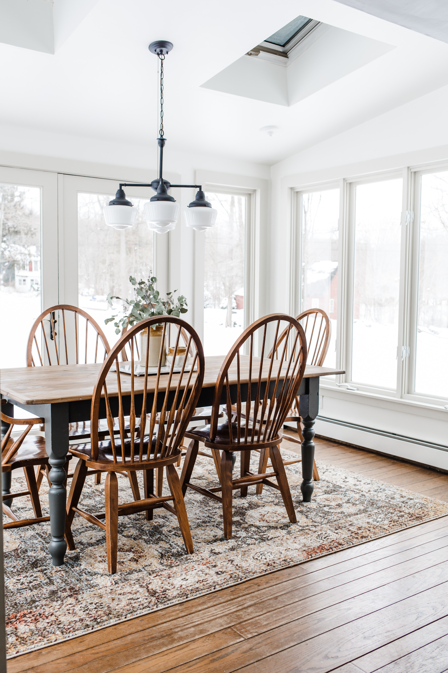
After:
What we did to the space:
First step was to clear all the furniture out of the room, then we removed all of the old window trim and the baseboards, took out the screens, and removed the old accordion blinds. Then we took out the old fan and removed all the dingy and dated electrical plugs and switches.
Once we had all the demo done, the boys and I got started re-trimming the windows. We went with a simple post and beam shaker trim, using a smooth primed pine from Home Depot to build it. This is the style in the rest of our home and I cannot believe how it instantly transformed the windows. It completely changed the look. Once the windows were trimmed we filled the holes and I calked every seam. (The calking ironically took the longest…)
Tools we used for demo and rebuilding the trim:

After the trim was done it was time for paint. Because our breakfast nook is a bright sunroom, I knew I wanted to keep it light. I’m not afraid of dark moody colors, but that was not right for this space. I knew white would be the best choice in here, but I didn’t want it to feel flat so I decided to add depth with the trim by painting it a soft grayish beige color. I love how it turned out and I plan to do the same in the rest of the house in any room painted white.
For the walls I went with the color White Dove which is a beautiful warm white that doesn’t really pull yellow because it has some gray undertones, and the trim is Natural Cream, literally the perfect soft light beigey gray color. Both are from Benjamin Moore. I love using their Ben line (paint and primer built-in) in a soft eggshell sheen.
Once the room was painted we installed a new schoolhouse light fixture. You can read about that process and why I went with a schoolhouse light here.
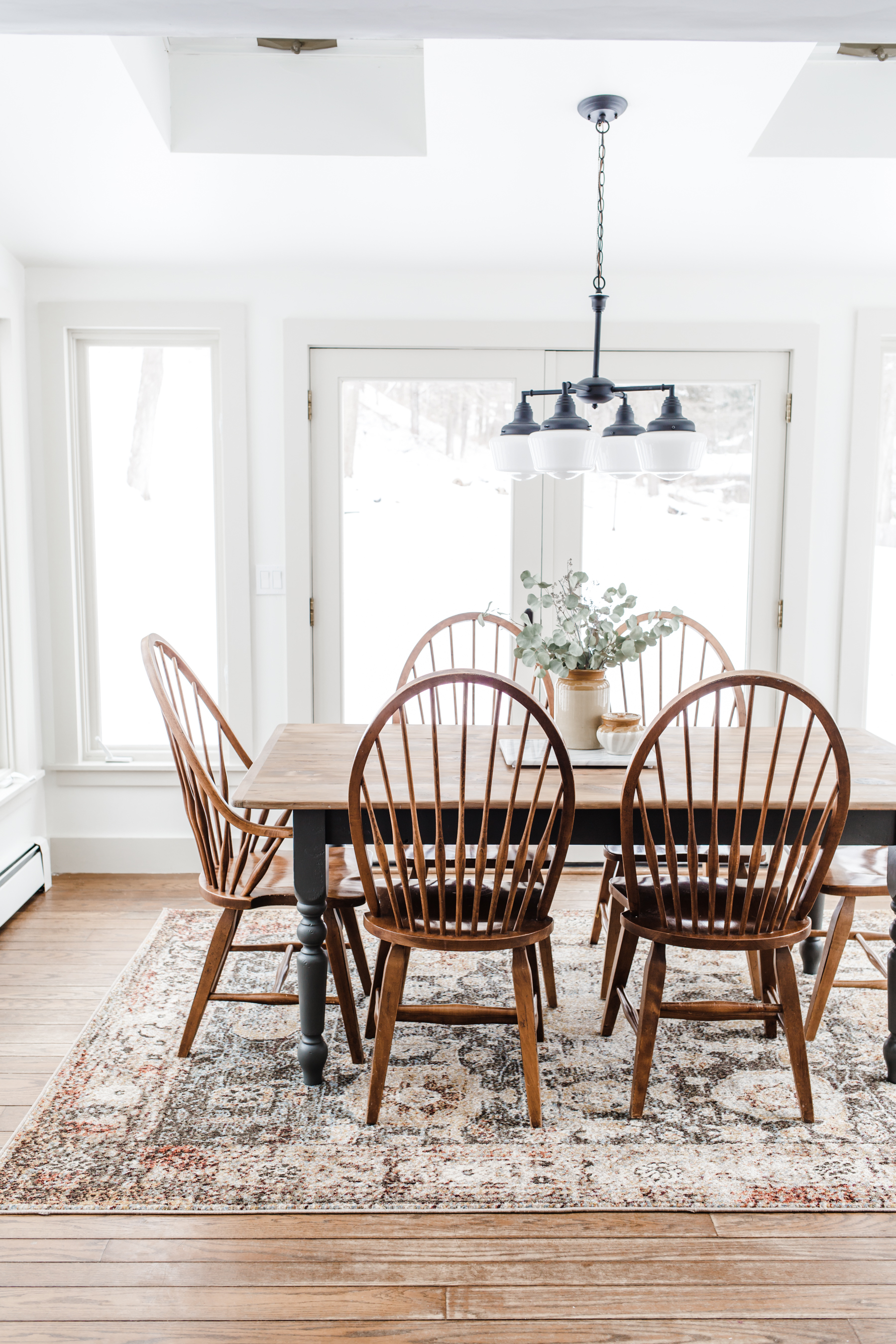
Now comes the fun part! Putting everything back in the room. I went back and forth on whether I wanted a rug in this space because, well I probably still have PTSD from all the milk spills I’ve cleaned up over the years with 4 kids… But honestly they’re all old enough now that spills aren’t even a thing, and adding a rug made this space so cozy, and gave it such great texture, I feel like even earlier on it would have been worth the risk. It’s our home, and I want to live joyfully in it, cozy rugs in the breakfast nook and all. I went with this pretty rug, which is a great price and it really pulled everything in the room together so nicely with the table, chairs, light and wall colors.

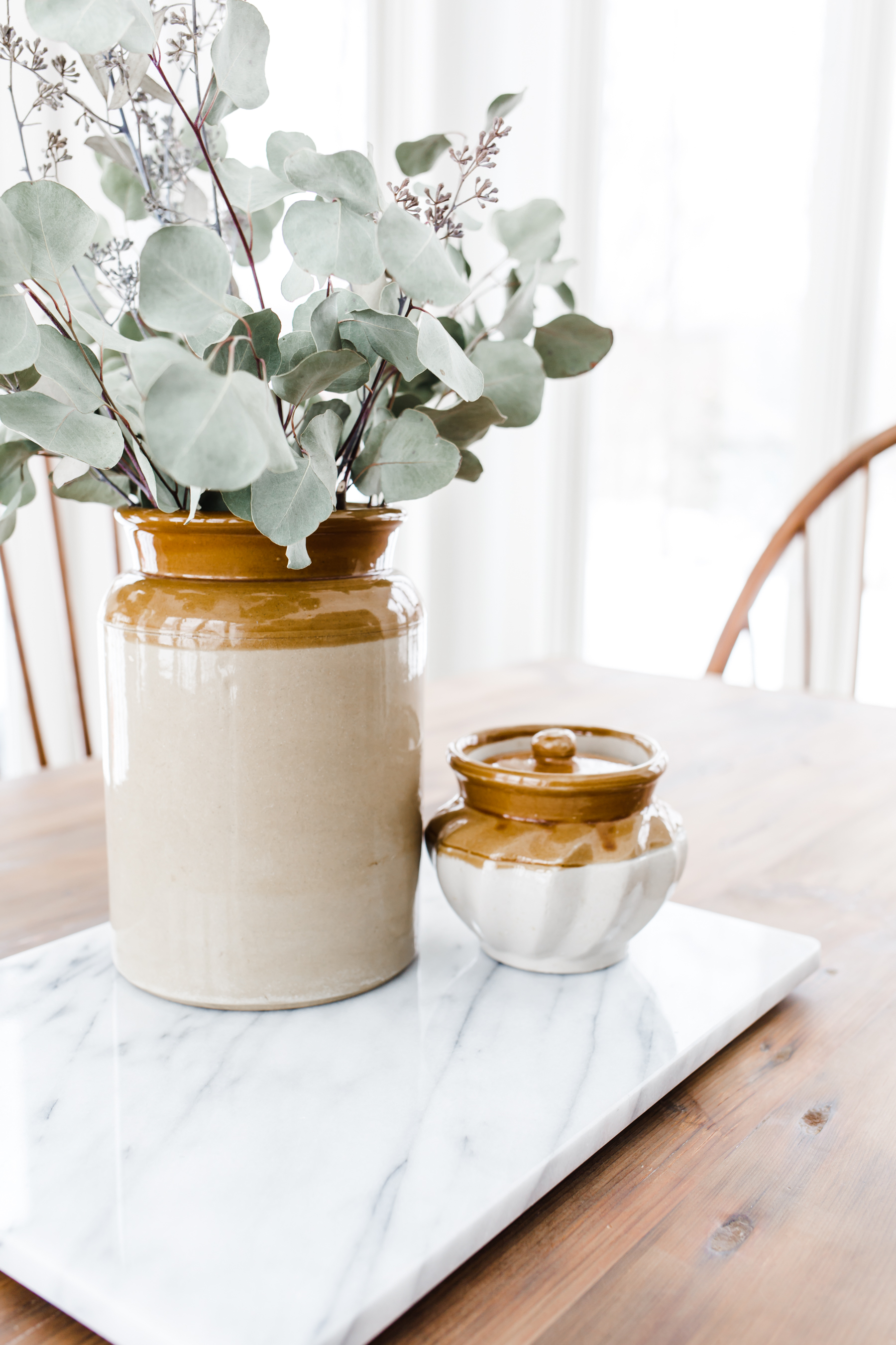
For the table decor I went with a very simple vignette. I like things to be pretty and functional in my house, and this is our everyday eating table, so I don’t want it fussy either. An antique English crock I found last weekend at a local antique shop with some dried Eucalyptus branches was perfect, paired with the mini lidded pot I found at a thrift store down the road from the antique shop (that matches perfectly, call that serendipity!), to hold sea salt. I placed them on my marble pastry board to brighten up the wood tones a bit, and it’s just a nice simple center piece for the table!
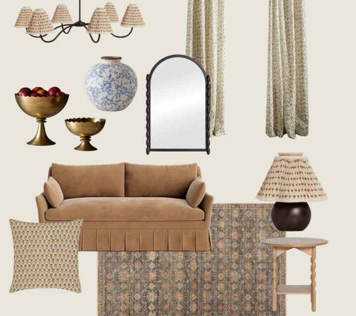
I linked some similar items below:
Budget:
Okay now, let’d talk budget, because that’s an important part of any project. I feel like for the change and the impact it has made on the space, the cost on this project was SUPER reasonable, especially since I was able to save on the furniture by buying secondhand and I love to create spaces with unique and more sustainable pieces so it was a total win.
Here’s the budget breakdown:
Antique Pine Table: $250 (found on Facebook Marketplace)
Windsor dining chairs set: $150 (found on Facebook Marketplace)
Wood window trim and supplies: $265
Paint, and furniture refinishing supplies: $165
Rug: $131
Light fixture: $106
Decor antique crock and salt pot: $33
Total cost: $1,100
For a total room makeover, including furniture, I was very happy with only spending $1100. I still have more than half of each gallon of paint left to use on future projects and I was able to sell our old kitchen table on facebook marketplace (I didn’t include that above) but it off set the cost by $200. So out of pocket we spent $900, and the room is completely transformed.
The great thing about creating a plan and a budget for a space is that you can start working on it and paying for it as you go. I bought the table in the early fall, the chairs in late fall, the rug in December, paid for the trim in January, etc etc. It makes the cost very manageable. And with how busy life is, that’s about as fast as I could get to everything anyway. I’m always telling Craig, as long as we’re making progress and improving our house, who cares about the pace. You can enjoy the process!
I hope this helps you feel empowered to make the changes in your home that will make it feel like a haven and fill you with joy. I thought for years that we were going to have to spend many thousands of dollars replacing windows, etc. to get this room looking at all good and it turns out there was a much easier and less expensive solution and now I just adore the space.
If you have any questions about this project feel free to ask below and I will answer!
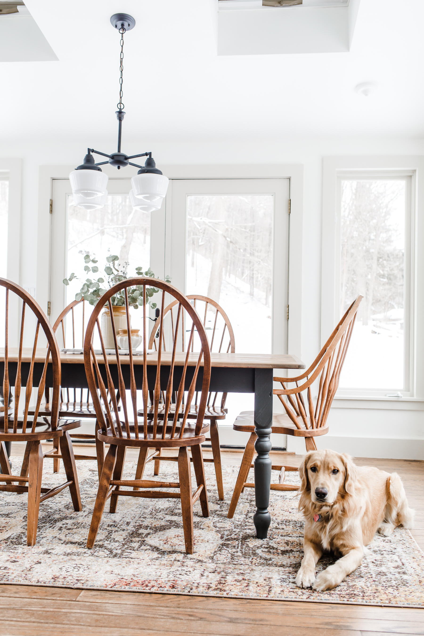




I love how it turned out!!
http://www.rdsobsessions.com
Looks so beautiful! I love that you found the furniture on Facebook marketplace. This inspires me to get on there and keep looking. I’m looking for a dresser for my sons room. Kind of gave up last month on marketplace.