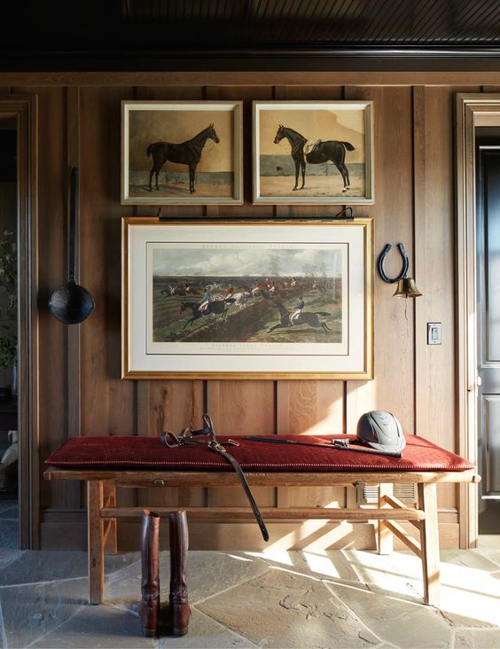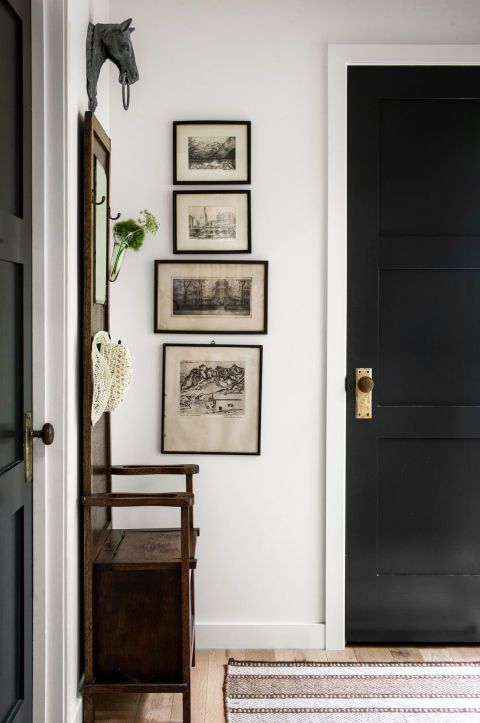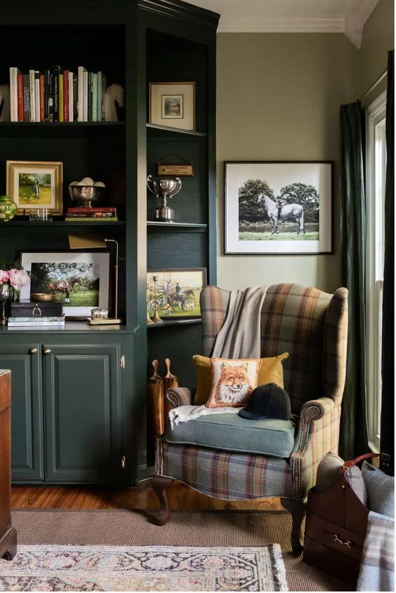
As a mom who loves all things vintage, designing a shared teenage boys’ bedroom in our historic home is a fun challenge. I have found the key is to work with the unique architecture and find design elements that complement the space. In this case, the focus is on creating a vintage equestrian inspired shared bedroom that will be perfect for my teenage boys.
The Inspiration:
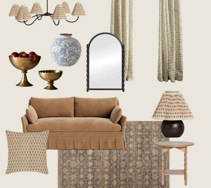
Planning the space: why I always do a mood board.
Before I start any design I always begin with a mood board. I have found it helps gives me clarity on how I want the space to come together and keeps me from making expensive mistakes. In this case I have the added benefit of helping my boys see a visual on the direction I’d like to go and what I am thinking, so they can sign off on the design.
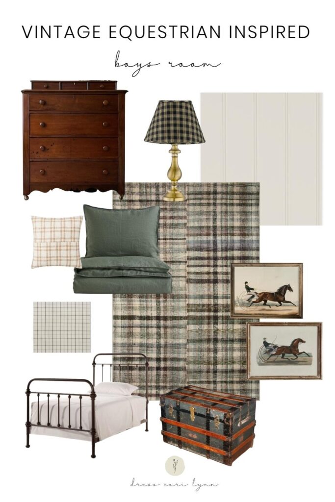
The Room Plan.
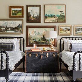
For my teenage boys’ shared vintage equestrian inspired room, the Chris Loves Julia x Loloi Humphrey rug in forest/beige is the centerpiece of the design. The rich green and beige colors in the rug set the tone for the room and add texture and warmth to the space. The dark moody green bedding from H&M will complement the rug and create a cohesive look that is perfect for a vintage equestrian theme.
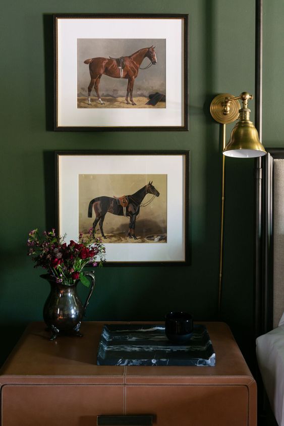
I’ll be incorporating these vintage equestrian buggy racing drawings into the design. They add a timeless and cheeky element to the room and while evoking a sense of history and tradition. My boys were particularly excited about these prints. I sourced a vintage steamer trunk for their room a few years ago and it is used as a unique end table/storage trunk between the beds. The vintage wooden dressers I scored in January add character and charm to the room while their two black metal farmhouse beds provide a sleek and classic touch that balances the vintage elements.
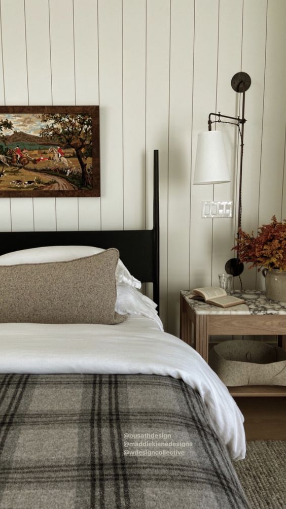
Finally, the walls will be finished with vertical shiplap and painted natural cream by Benjamin Moore. We considered going dark on the walls, but with the combination of the low ceiling, large dark wood beams, as well as the saturation in the rug and bedding, it felt necessary to keep the walls lighter to balance the space out. Natural cream is a great light greige color that works flawlessly in lots of lighting situations and creates a clean and classic look that is perfect for our historic home. The cream color will brighten up the space and contrast beautifully with the dark ceiling beams.
That is the plan for the space and now comes the fun part, getting it done!
Designing a classic space for two teenage boys can be a challenge, especially in a house like ours, but by incorporating classic choices and being intentional you can create a cohesive and timeless look. Remember to work with the unique architecture of your home, and have fun with the design process. I’m excited to see how this comes together. Stay tuned!

