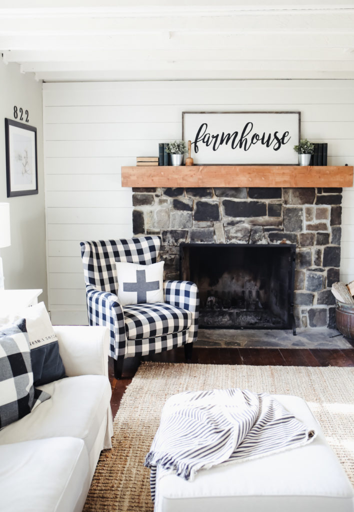
Okay guys, it only took me 8 months, but I finally have an update for you on our family room makeover. The one thing I’ve discovered about myself over the last 9 months of living in our farmhouse is that when it comes to designing spaces, I’m a real slow-cooker. When I have a design pickle, it takes me a while to sort it out. For example, exhibit A: our family room. Craig and I started working on this room almost the moment we moved into our farmhouse. (You can see the before here.) Besides the kitchen it is the most used room in the house. It’s where we sit by the fire and read, watch movies as a family, play games and just hang out together.
My mom gave me some really good advice years ago when I was overwhelmed with decorating our second house. It was twice the size of the little crackerbox our first house was and I didn’t really have any furniture or any clue where to start. She told me to start with one room, and just work on that room until it was finished. Then I would have one space that was finished, that made me happy, rather than spreading my time and resources across a bunch of spaces and not really making progress in any of them. It turns out, that was really good advice (that I’ve used in a lot of different applications) and it’s really helped me not get overwhelmed over the last 9 months as we started tackling our farmhouse.
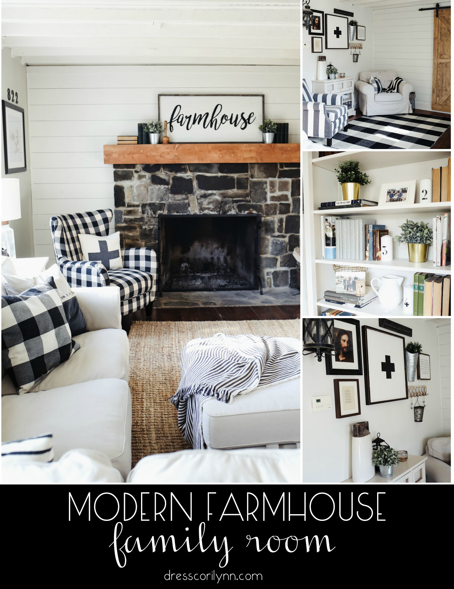
So let’s talk about the family room, shall we? First of all this room presented a lot of design challenges. So let me tell you about those and then what I did to work around/with them. First of all, the family room is a long narrow room, while it’s actually quite large it’s narrow enough that figuring out where to place couches and the TV etc. Was a little tricky. It also left us with a big empty space my the entry door and no idea what to do with it. The ceilings are also lower than more modern houses (just around 7 feet), and the beams were originally stained a dark, dark brown (almost black) which made the room feel a little like a cave. Also, because our house was built over 100 years before they invented electricity a lot of our lighting is wall lighting, so enter the awkward sconce situation you see below. When we moved it the wall around the fireplace was this ugly wood paneling and it had a terrible mantel. Beside those, we have your basic old house lack of level floors and ceiling, but those were the major issues with the space.
click through to see more images of the room and what I did about each design challenge:
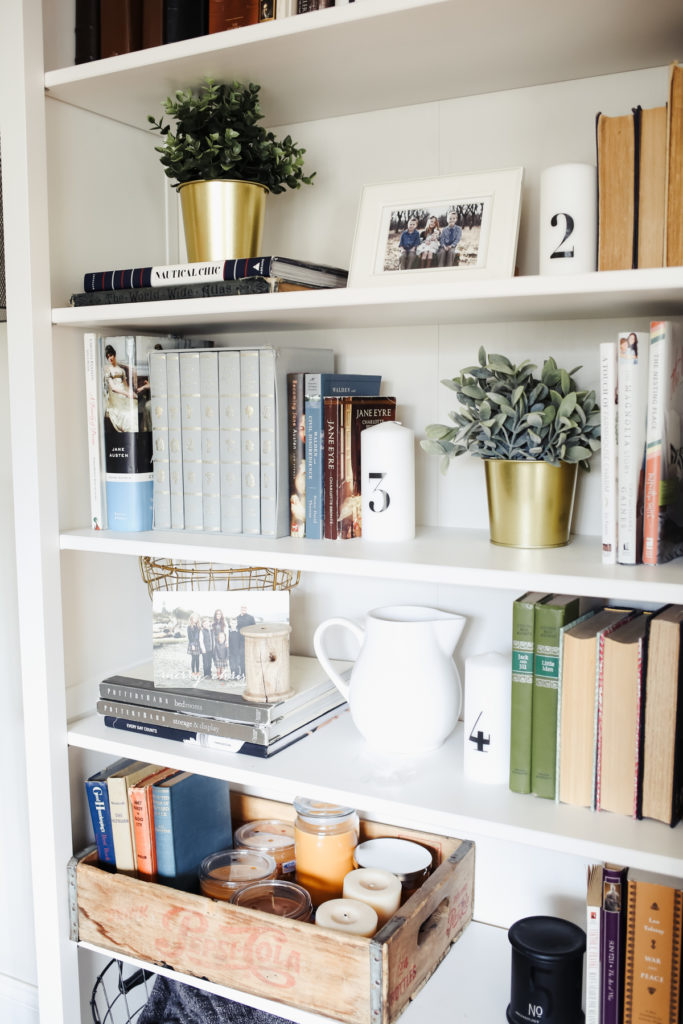

Sectional. Buffalo Check Chair. Striped Chair. Bookshelves. Jute Rug. Buffalo Check rug. Antique books. buffalo check pillows. swiss cross pillow. hooks. apolis tote. striped throw. floor lamp. similar swiss cross wood sign. antique French clock. farmhouse sign. similar sliding barn door (ours was made by Craig.)
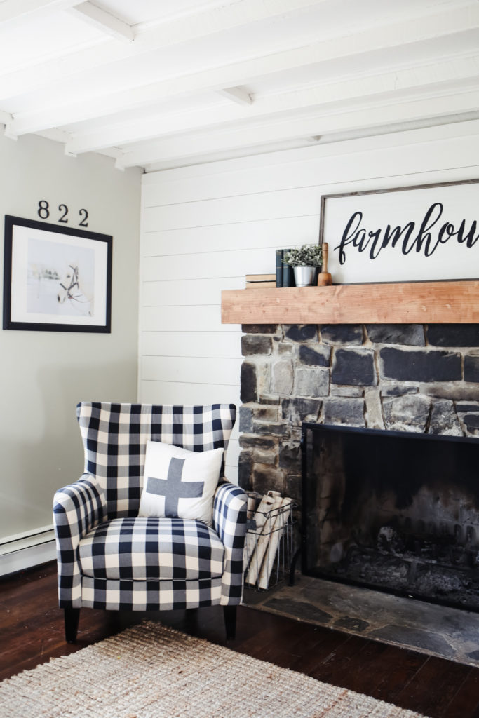
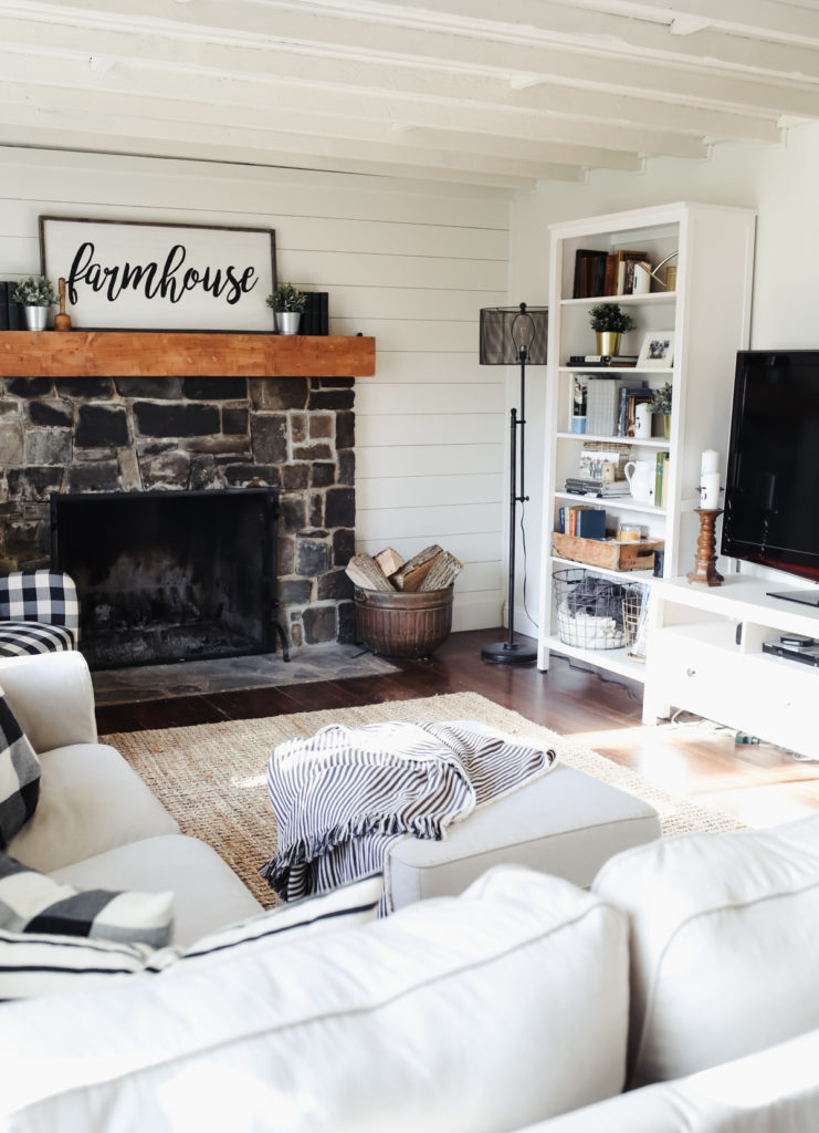
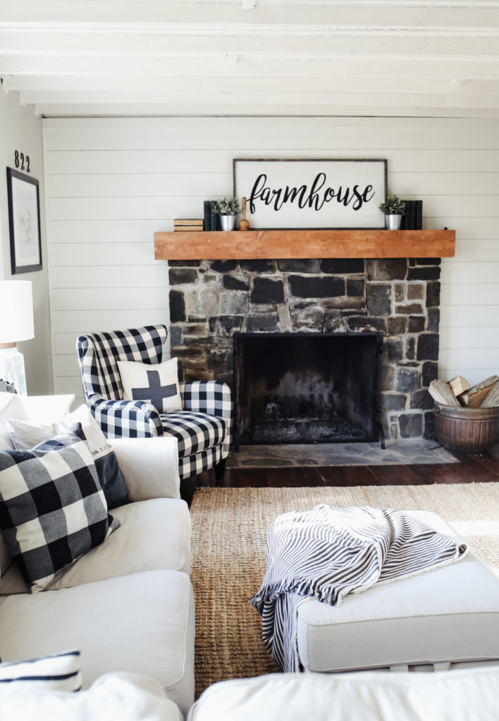
My goal with the update was to really lighten up the space and create a warm, but fresh modern farmhouse feel. The first step was ripping out the old paneling around the fireplace and replacing it with shiplap painted white and a big reclaimed mantel. That got the room “livable,” as in I could stand to be in there. Next was figuring out how to furnish and arrange the furniture in the narrow space to fit our needs but still feel aesthetically pleasing. I literally arranged and rearranged this room 100 times before I finally settled on something that fit and felt right. (Just in time for Christmas, meaning adding a tree and rearranging everything again, lol.)
I also puzzled about what to do with the beam problem and eventually decided to go ahead and paint them white. We have exposed wood beams through our whole house, so I wasn’t super concerned with covering them up. Plus, I’ve learned you’ve got to make the right design decisions for you, and not worry about purists who would “never paint wood.” It took me more than half the summer and was literally the job from hell to paint these beams (I had to prime each one twice and then two coats of paint, all with a brush, not a roller, and it took even longer than it sounds, my neck is still kinked) but I am so happy I did. It immediately brightened and heightened the room, and I love the texture the white beams give the ceiling.
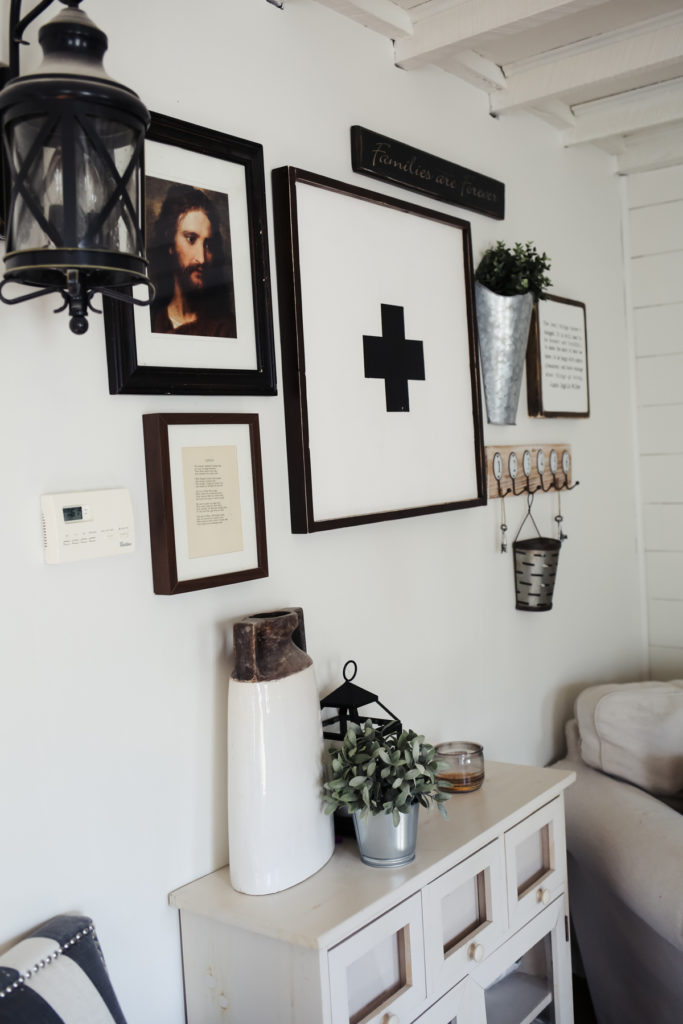
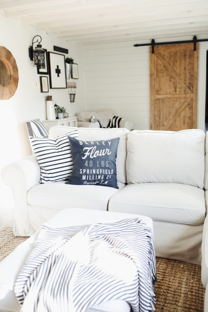
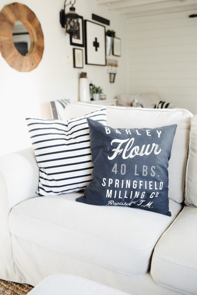
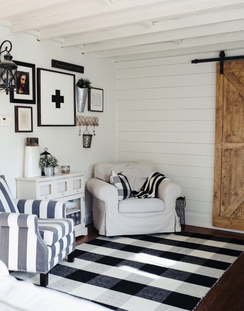
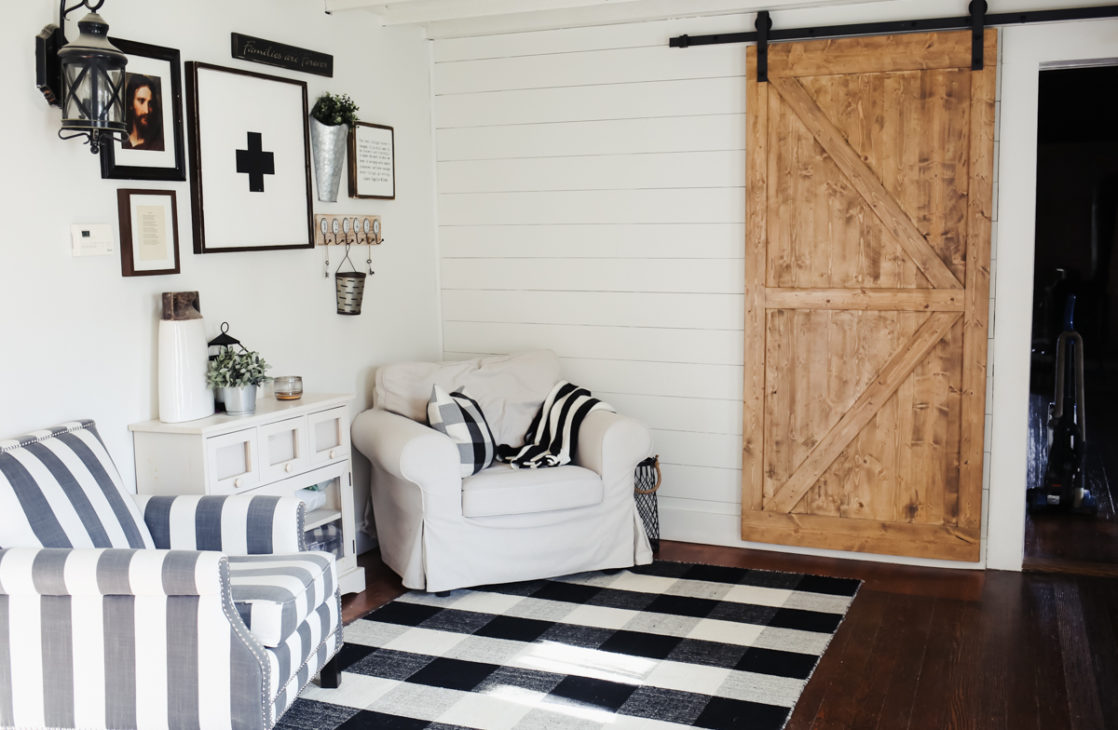
Next was figuring out what to do with the awkward wall sconce. To make it blend in and look more natural I designed a simple gallery wall around it. I was skeptical that it would make a difference, but it’s amazing how much you don’t notice the light fixture anymore. Plus, I love a good gallery wall. I think they fit really nice in a farmhouse because they are supposed to feel collected and personal.
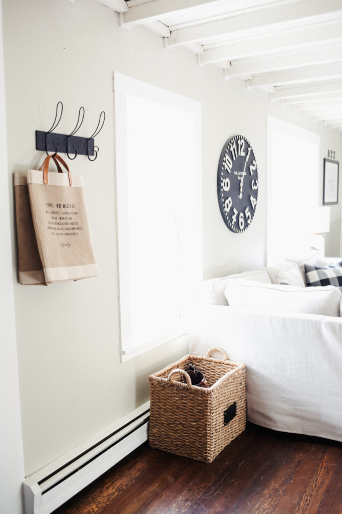
Around the gallery wall is the awkward entry space. I literally spent months trying different ideas for how to use this space and we ultimate settled on creating a little sitting area, which I actually love. I find we end up sitting here to chat or read even more often than I thought we would and it makes the house feel so cozy. I also love how it accents the sliding barn door Craig built for the room.
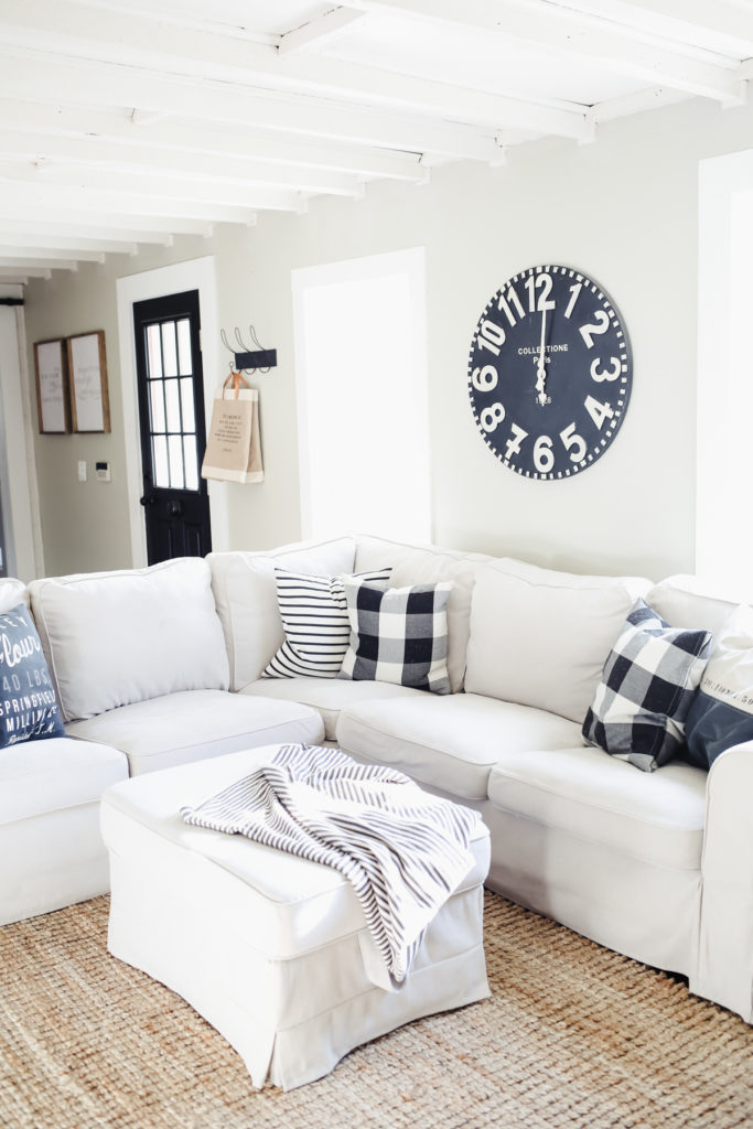
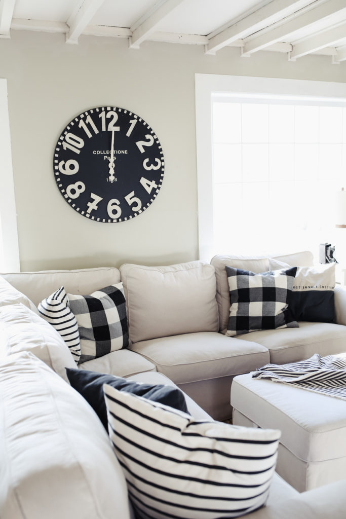
I changed out our gray Ikea Sectionals slipcovers this spring for these bright off-white/beige ones, and I love them. I was a little worried about going that light in our house with 4 kids and a small dog, and a real fireplace that we actually use (that creates ash, etc.) but it turns out they have been perfect. The kids aren’t aloud to eat outside of the kitchen, which helps a lot, and if they get dirty, I just slip them off and throw them in the wash, and they’re good as new.
Since I kept the pallet very neutral in this room I wanted to incorporate some good plaids and stripes into the space, and I did so with throw pillows, this buffalo check rug and our sitting chairs. This buffalo check chair is my most recent find and I am obsessed.
So there you have it! If you have any questions about the space be sure to ask them in the comments and I’ll make sure and get back to you. Right now we are working on choosing our furniture for the living room (we’re going with a modern French farmhouse style in there- a little more formal) and I can’t wait to show you how it turns out!
Sectional. Buffalo Check Chair. Striped Chair. Bookshelves. Jute Rug. Buffalo Check rug. Antique books. buffalo check pillows. swiss cross pillow. hooks. apolis tote. striped throw. floor lamp. similar swiss cross wood sign. antique French clock. farmhouse sign. similar sliding barn door (ours was made by Craig.)


omg.. i love it..God Bless your home.
thank you so much Milly! xo
Pretty sure you meant “allowed” not aloud, although children can be that as well. :)
lol! Yep that’s def. what I meant! ;-)
Love this room! The sitting area is perfection!
thanks Lynn! So kind of you to say. xo