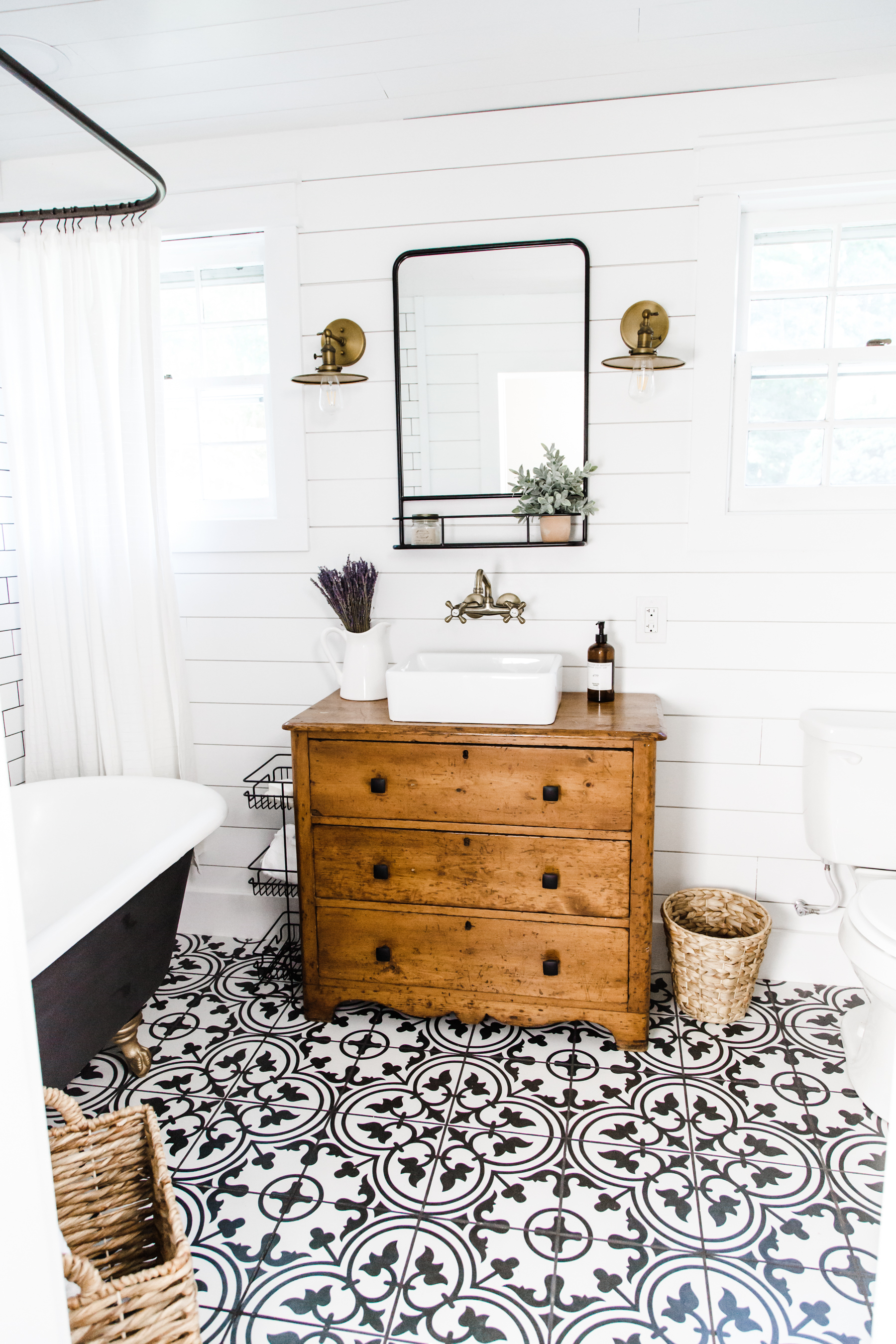
This has been a (very) long time coming, but today I am so excited to share our modern farmhouse bathroom remodel! When we took on this project last year, we were both naïve to exactly how big this project would be and how much work and time it would take, but in the end we are basically giddy about how it turned out. Every day I walk in this bathroom and want to sing with joy (and often do, if I’m being honest). I’m going to take you through the whole journey with this space and I will include info and product details and links to everything we used at the bottom of this post.
Let’s start at the very beginning (Julie Andrews said that’s a very good place to start, after all). When we walked through this farmhouse for the first time before we bought it, we fell in love. It was such a cool house, with so much potential. But. And this is a big BUT… the bathrooms were awful. I knew that would be one of the first major remodels we would have to do, and I knew it was going to be a big, messy, exhausting job. Nothing is simple or straightforward when you remodel an old house. When you take up an old floor there isn’t just nice pristine subfloor underneath, in truth, you never really know what you’ll find. Old wiring and plumbing often need to be replaced and walls need to be rebuilt. It’s not simple, but we are grateful that we get to be stewards of this amazing historic house and that we will be part of its long and interesting story.
So let’s talk about what this bathroom was “before.”
BEFORE:
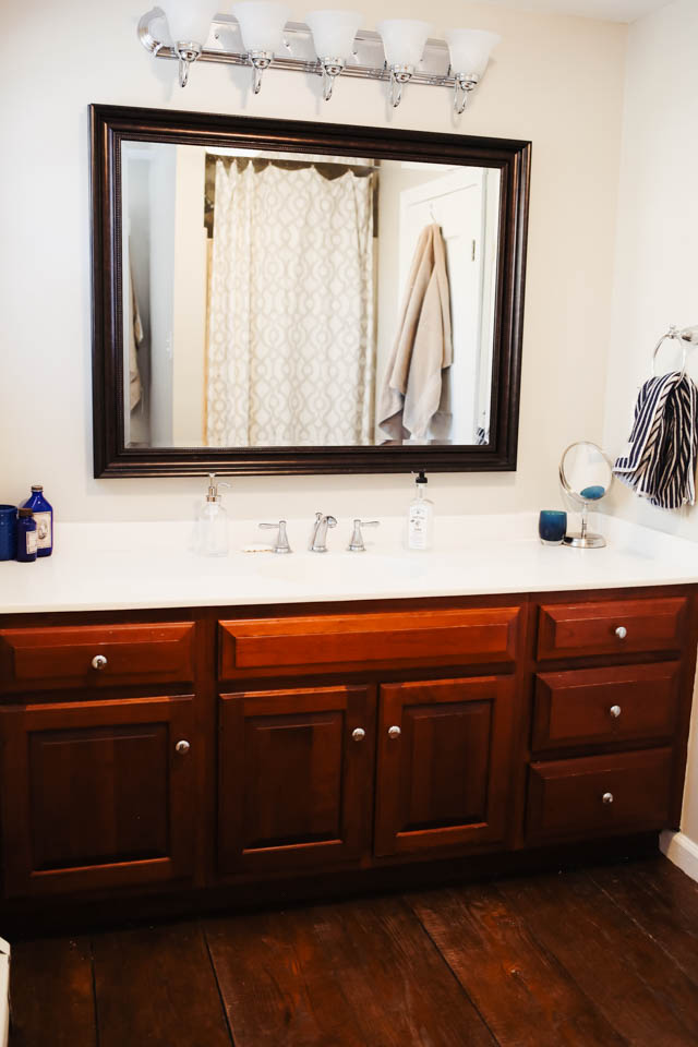
It was an old outdated space with original wide-board wood plank floors, an old and awkwardly low vanity on one side, a big unusable space in the middle, and a grubby little tiny shower on the other side of the room (like it was literally the smallest shower in the world), with the toilet tucked into a nook in the corner. The door swung in and made the space super awkward. You’d have to open the door, walk in, walk around the door and close it to get to the vanity. Not ideal.
Now, let’s talk about those wood floors. I know it sounds cool to have original wide board wood plank floors in your bathroom, but its not. It’s disgusting. Wood and water do not mix, and these floors were rotting and moldy. It was in a word, gross.
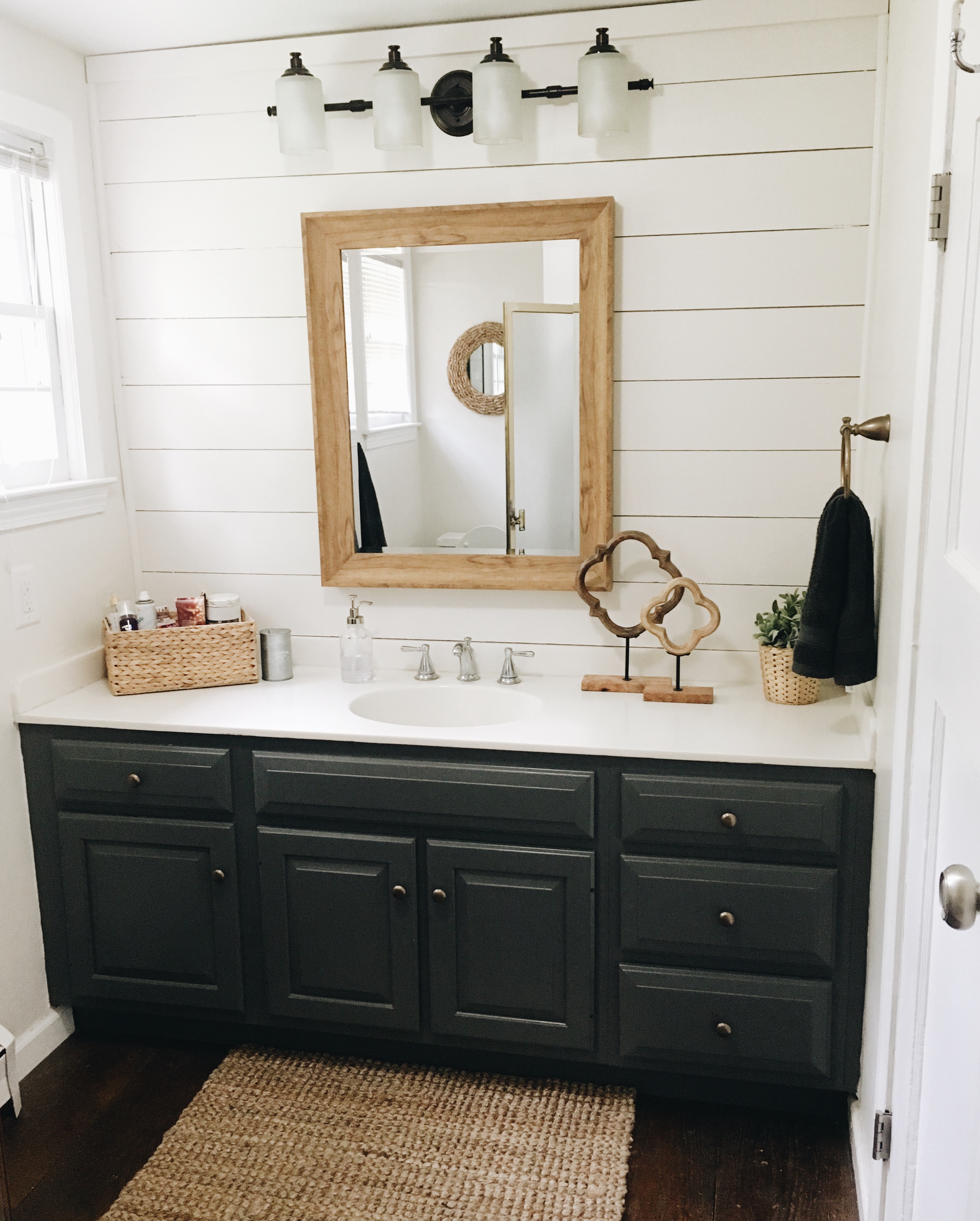
A few months after we moved into the house, you may remember, I did a little mini-bathroom refresh on this space. I knew it was going to be at least a little while before we got started on a full on overhaul of the space, and frankly, I just couldn’t stand looking at it, or being in it any longer. I put up some shiplap, painted the vanity, covered the shower with a curtain, replaced the mirror and light fixture and spray painted all the hardware so it didn’t look quite so dated. It was a bandaid on a broken arm, but it made the space a much nicer place to be. Until we ripped the whole thing out.
And now let’s talk about what went into the full remodel.
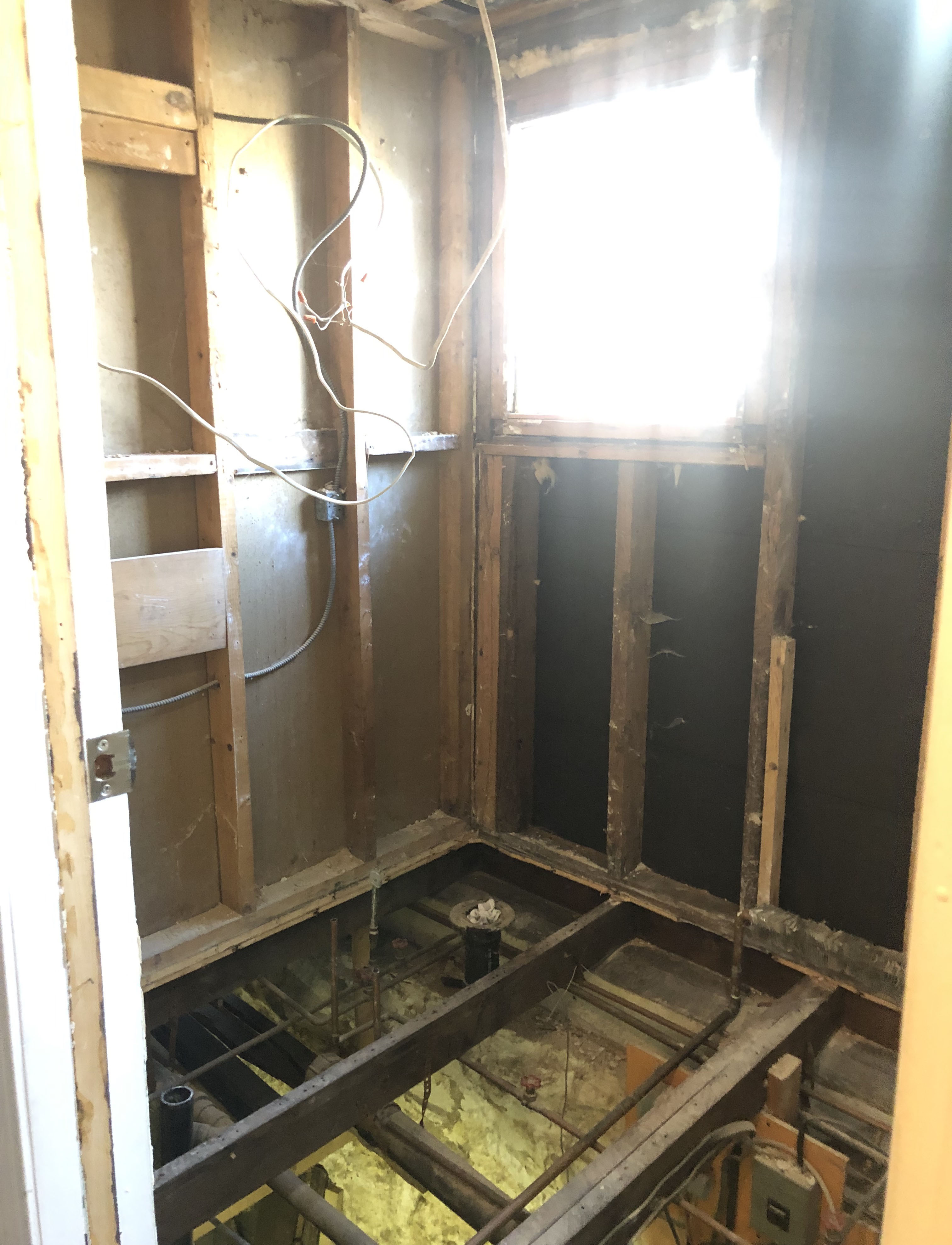
The first step was to demo all of the old bathroom. We knew we wanted to completely reconfigure the space, because it was used so poorly laid out, so we basically ripped everything out down to the studs. Shower, vanity, sheetrock, plumbing, everything. Then we took up the floors. What was underneath was… interesting. The subfloor was another layer of wood paneling and much of it was rotting. The whole thing needed to be pulled up. Once we did that we also realized that many of the floor joists needed to be reinforced, and rebuilt. That was a huge project. We literally had a hole in the middle of our house down to the basement for months. (My favorite naggy thing to say was “we literally have a hole in our house. Craig loved it. Not)
Before we could even get into the business of putting the space back together there were several behind the scenes problems to solve. First, my husband replaced our hot water system for whole house, moving from an old boiler to an electric hot water tank. He had to restructure the electrical in the basement and reroute the water coming in to accommodate the new system. Then he completely rebuilt the plumbing system in the basement for the house, a whole new manifold, new pipes, an entirely new filtration system, etc. It was a job. (My husband ordered this book, so he made sure it was all done correctly and up to code.) But this will make future renovations on the second bathroom and kitchen go smoother as well, and we’re all about about that. The bathroom also needed to be completely rewired and replumbed. This involved relocating all the drains and supply lines since we totally reconfigured the space. We also had to relocate the heaters in the room as well.
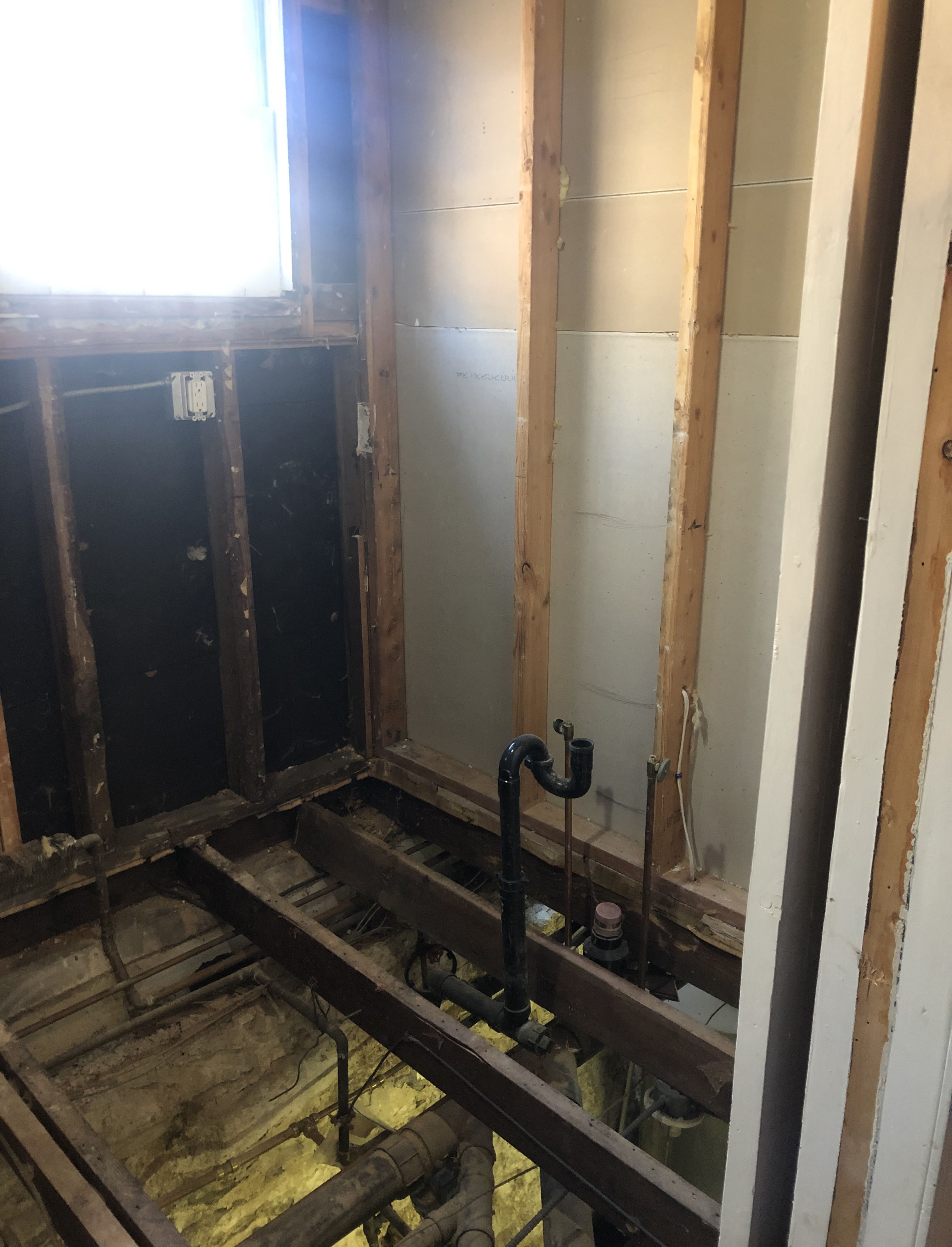
Once the behind the walls stuff was done, the subfloor was put down and we got to the business of turning the space back into a room, and not a hole. Subfloor went down. With the wiring done, we reinsulated and were ready to start putting walls back up.
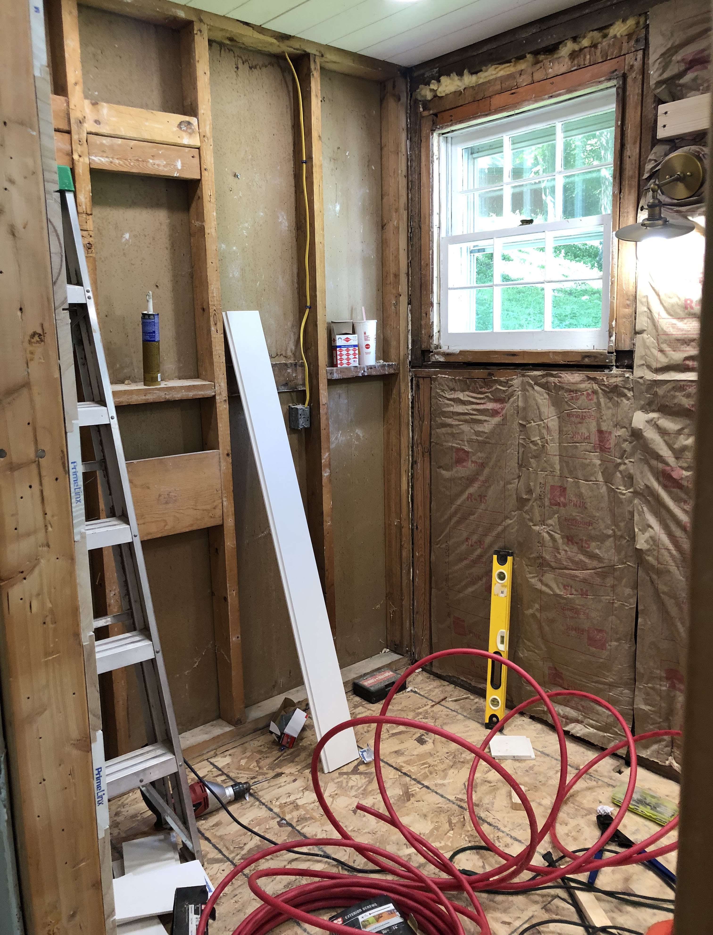
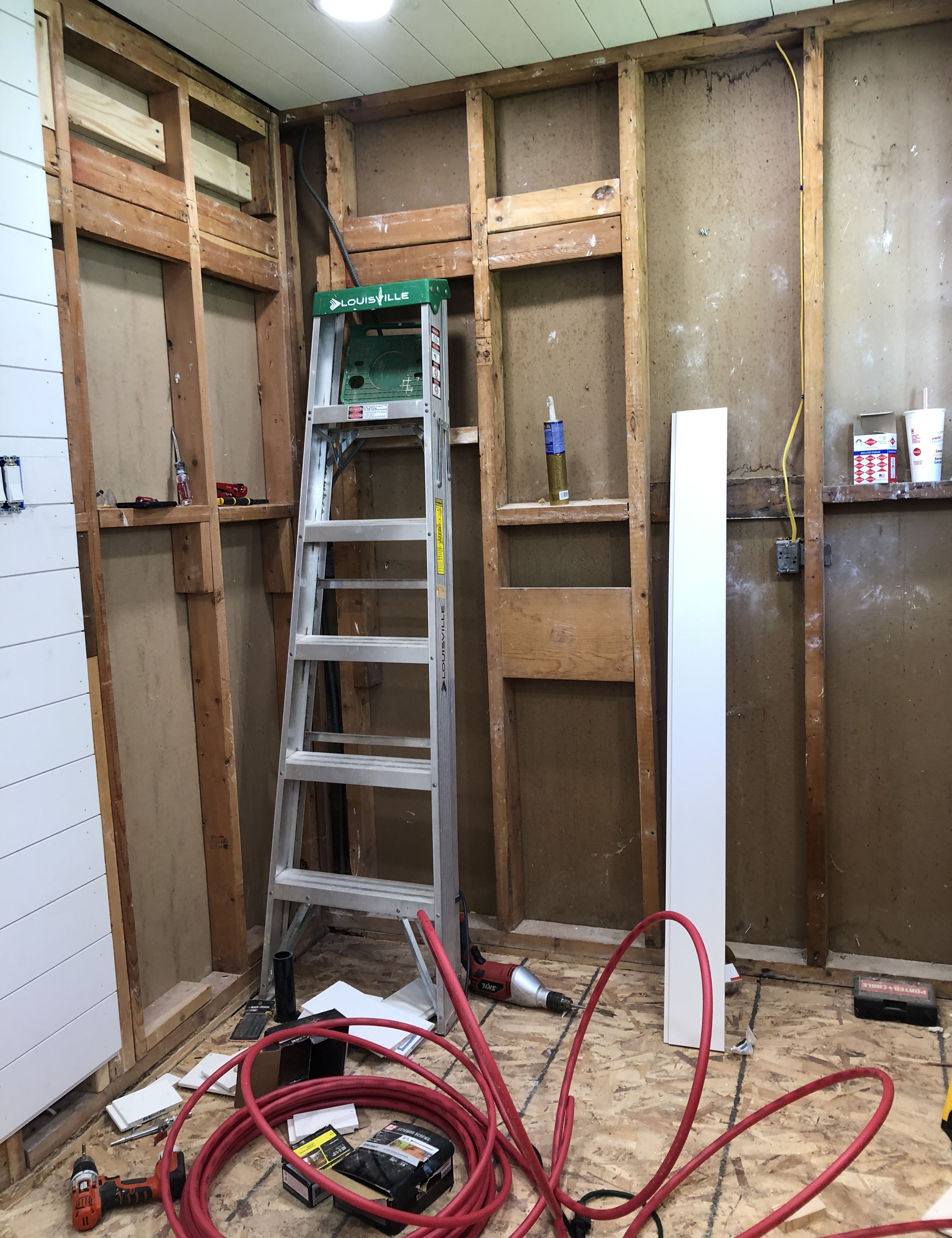
The design plan:
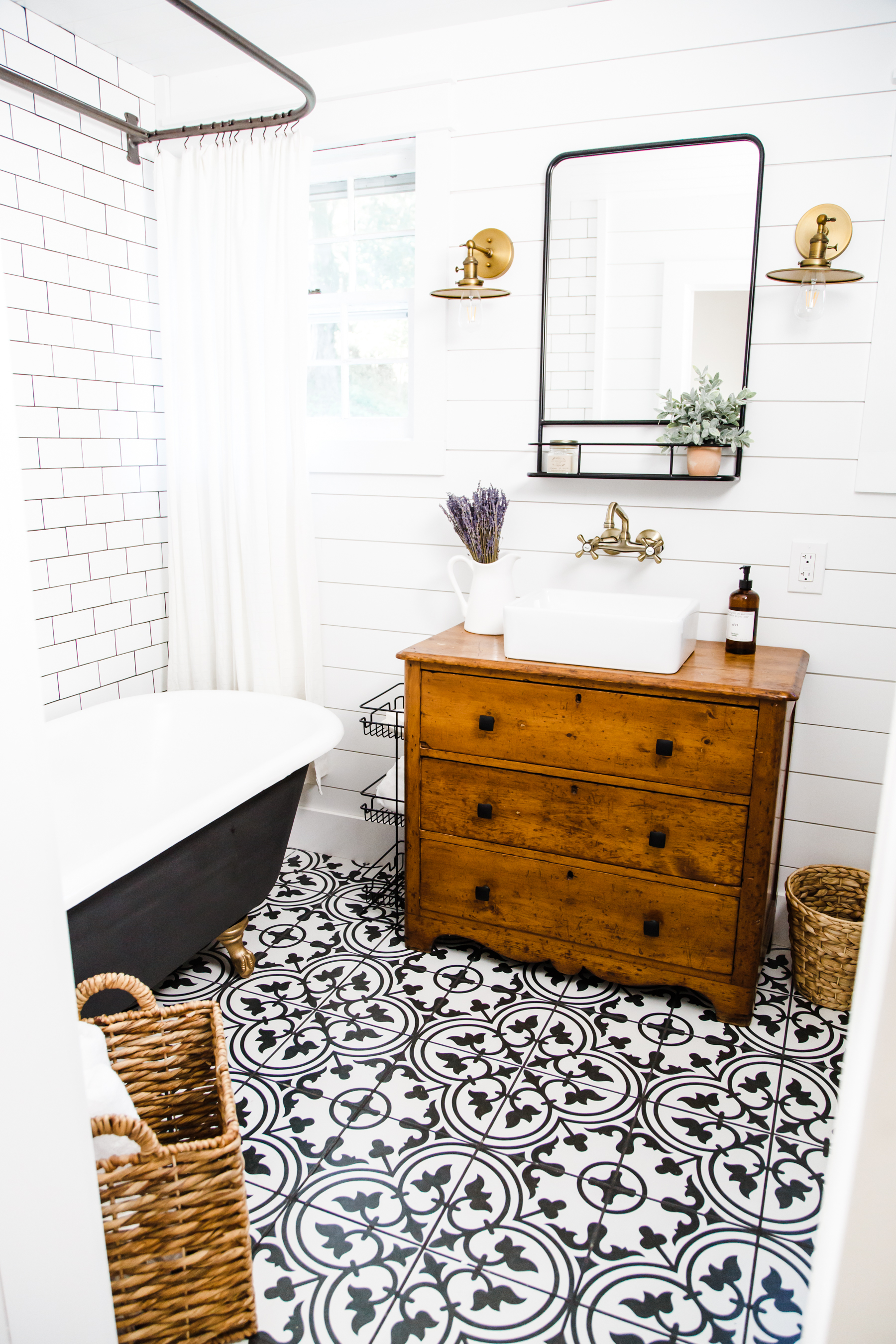
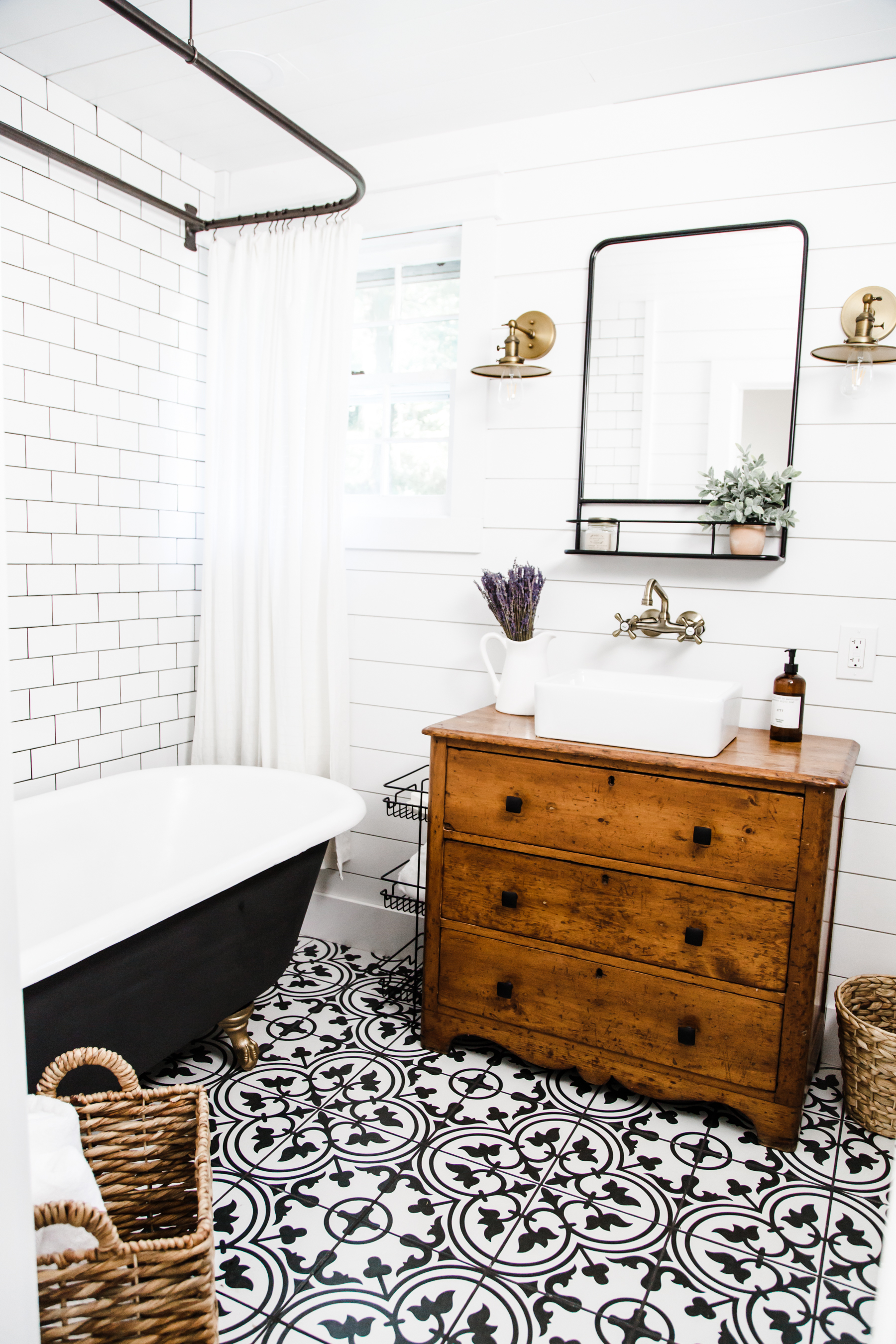
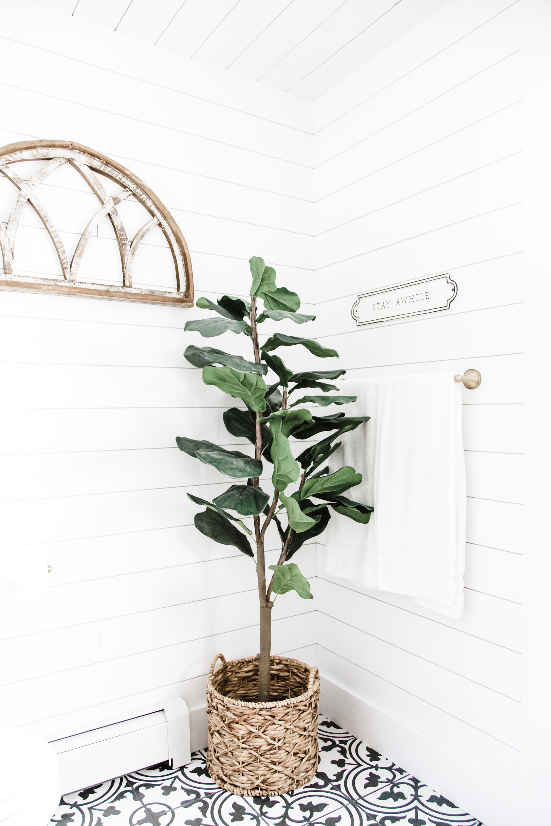
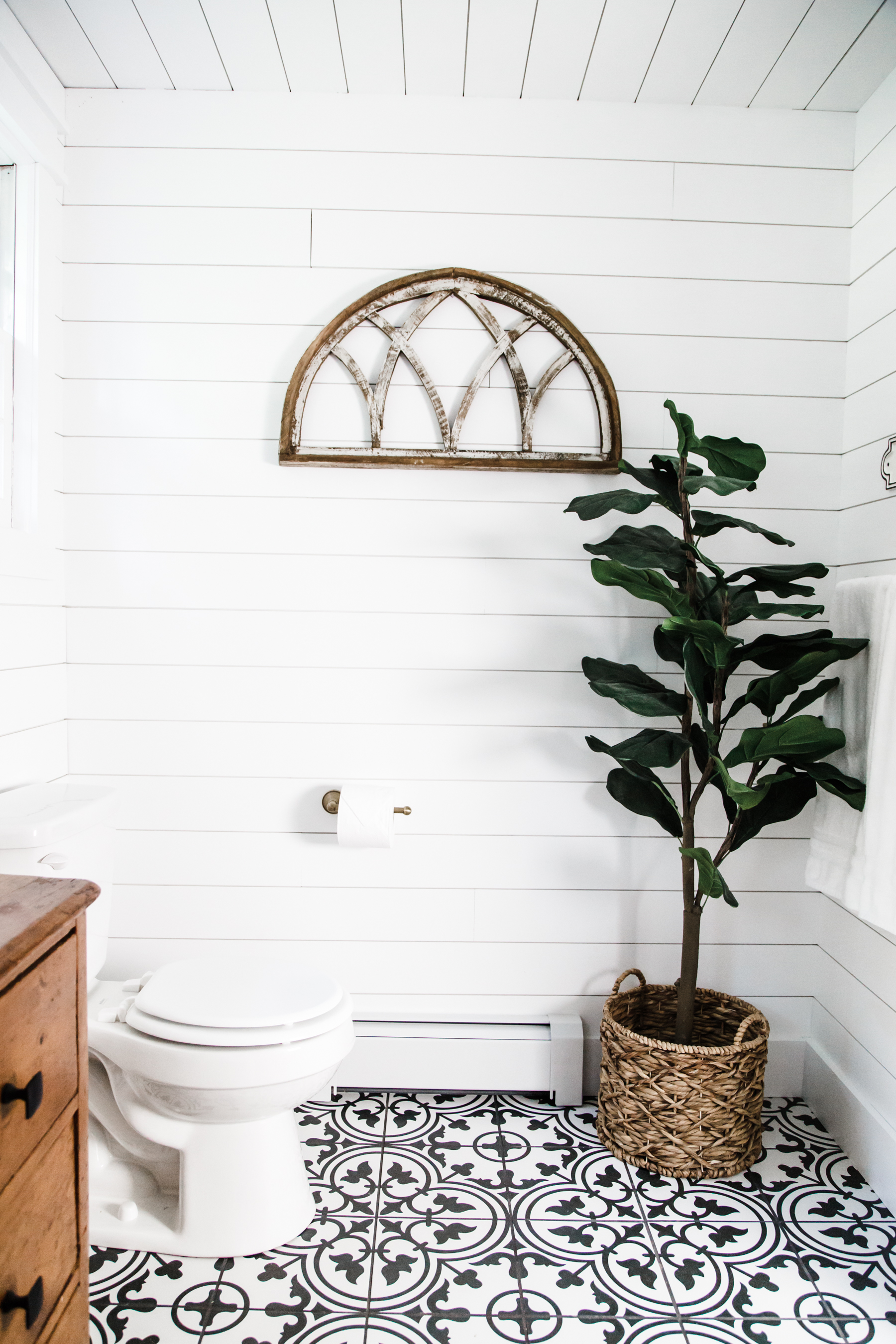
In this space I wanted a bright modern farmhouse feel. I wanted black and white and warm wood tones. I wanted to do mixed metals (antique brass, black and oil rubbed bronze), and I wanted to incorporate authentic antique pieces into the space, things that felt true to the home: namely a real vintage cast-iron claw foot tub and an antique dresser converted into a vanity. That was the overall deisgn plan. Here’s how it played out.
Walls:
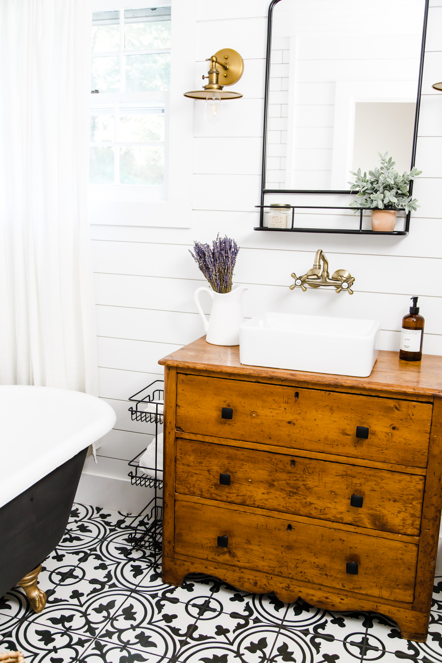
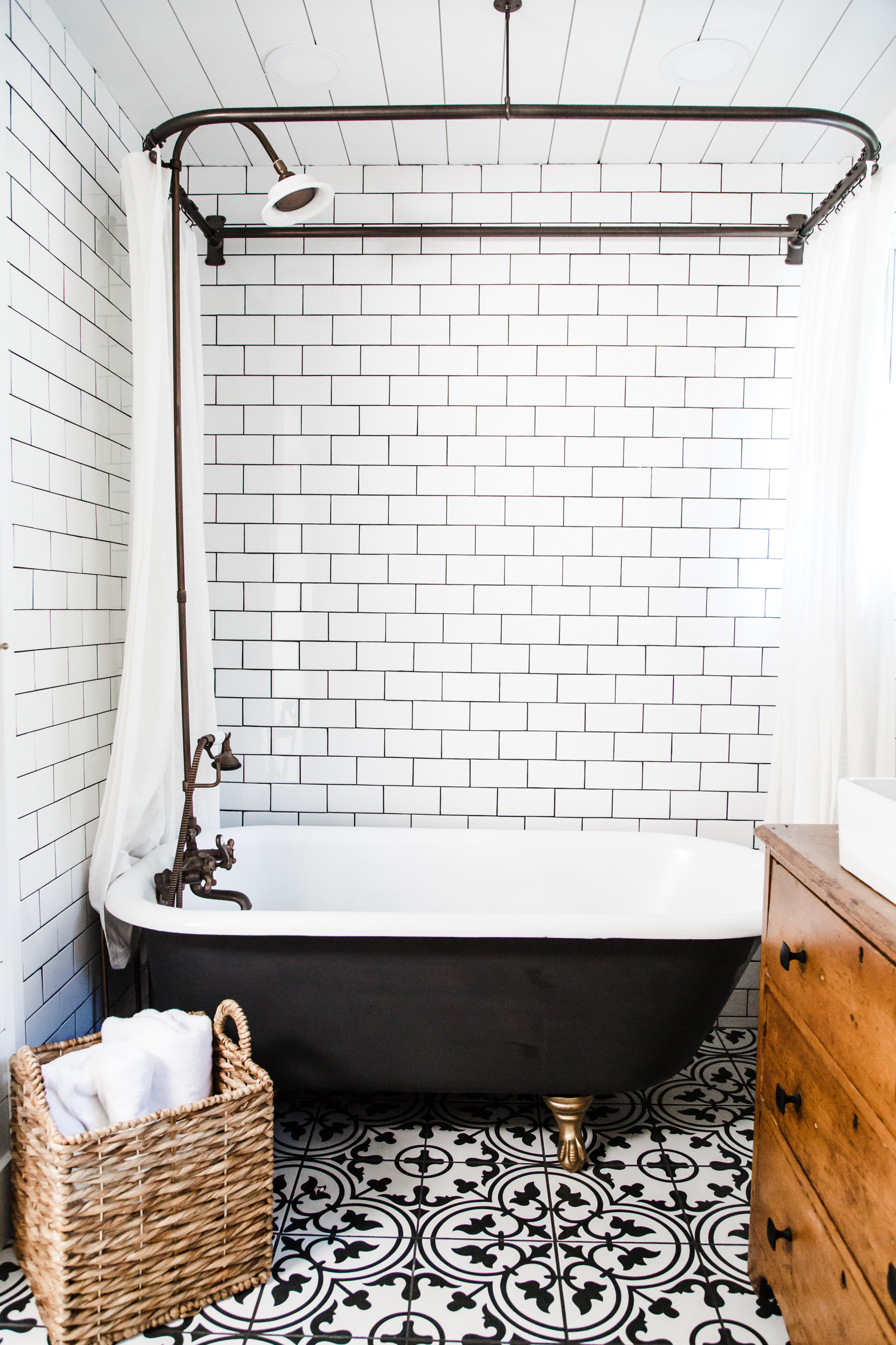
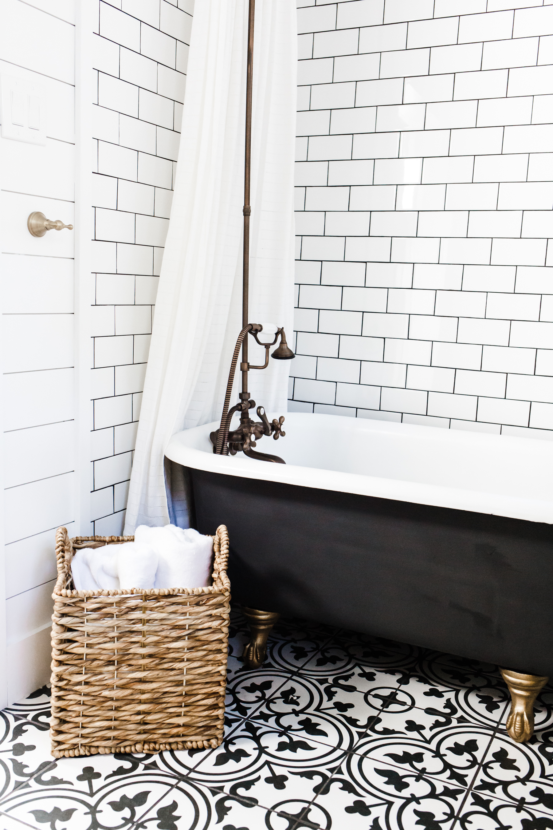
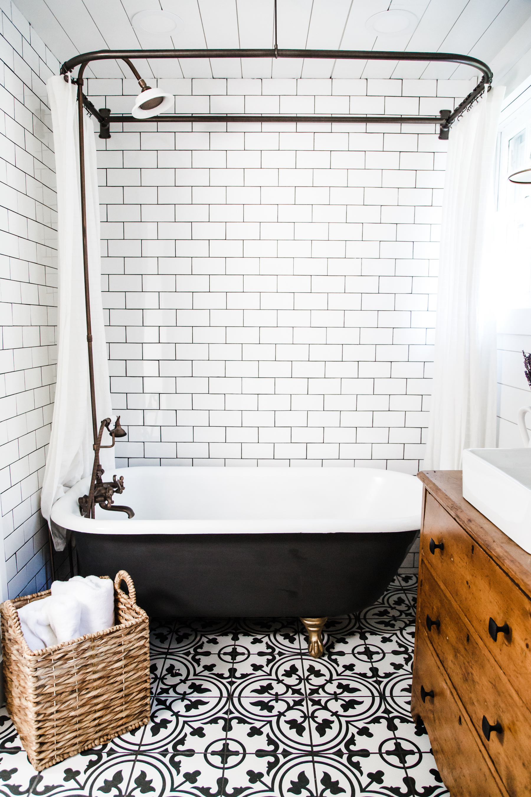
We decided to go with these primed locking shiplap planks rather than faux shiplap because we wanted the real thing and also it will be much better to minimize water issues long term. They are amazing. We did them on every wall and the ceiling (except the wall around the tub that has the tile.). This was a labor of love project. Very time intensive, but so, so worth it. I love how it adds texture and visual interest to the room which still being white. We painted all the walls Ultra White by Sherwin Williams. On the wall around the tub we went with a classic white subway tile and a dark charcoal grout. This would help with moisture issues from overspray and make a big statement in the room. I LOVE the way it turned out.
Lighting:
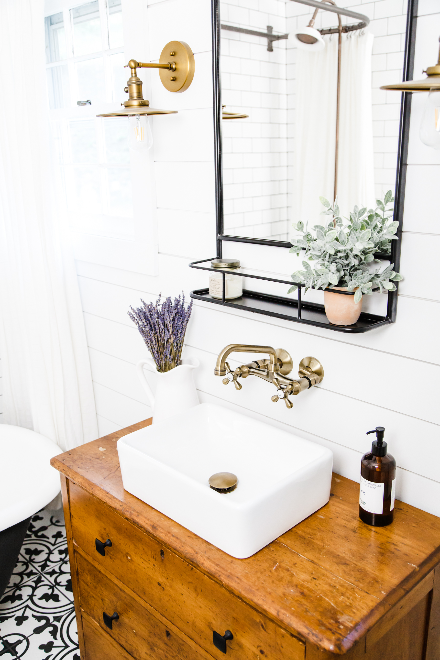
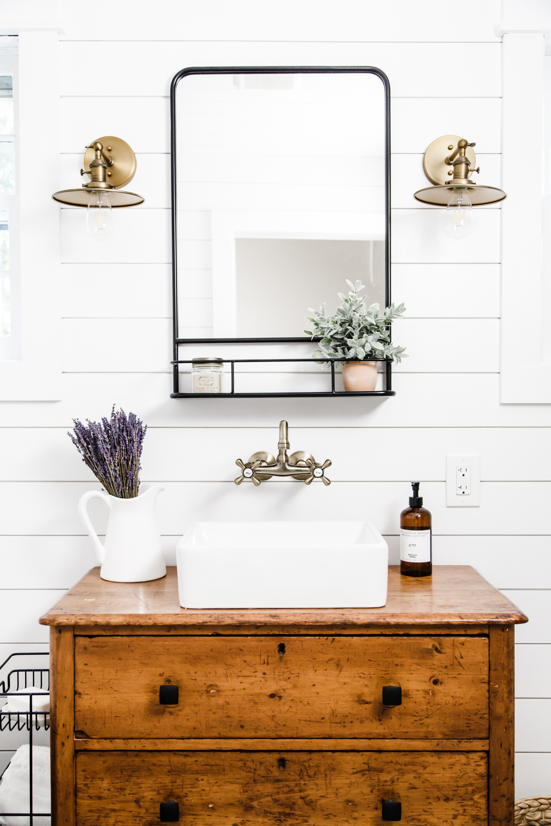
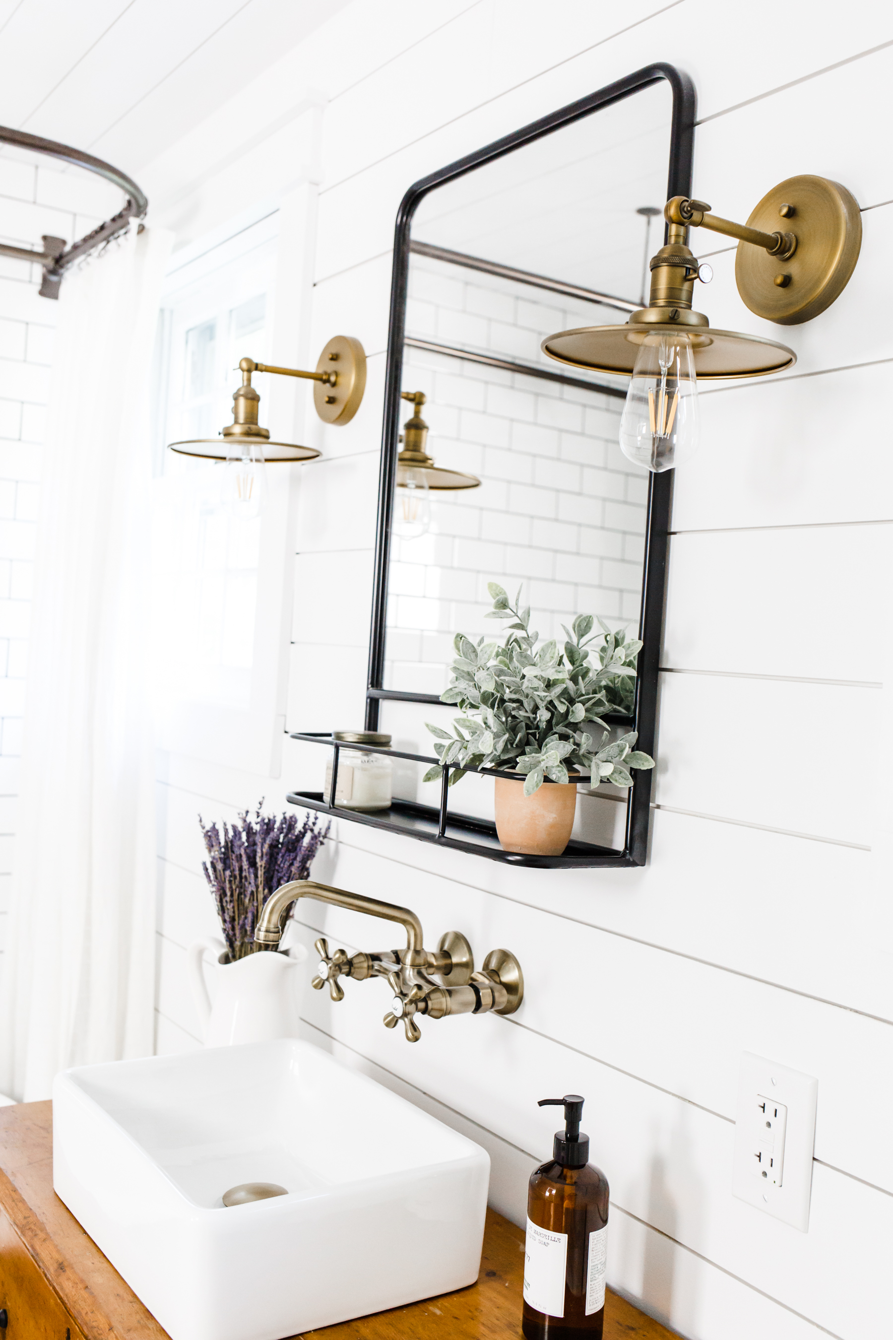
We added lots of new lighting in this bathroom, it was very dark and dingy before so it was really important to us that it be a very light bright space. We did 4 of these slim ceiling can lights and these two sconces over the vanity which I found through Jenny Komenda. They are meant to have Edison bulbs, but I find those lights to be rather dingy so I ordered these LED Edison bulbs that have a really clean color cast and high lumens. The bathroom is the brightest most cheerful space and I am obsessed.
Floor:
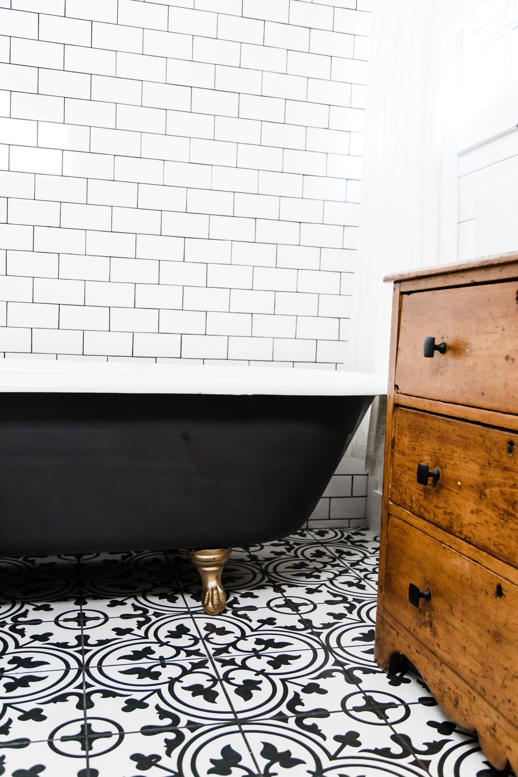
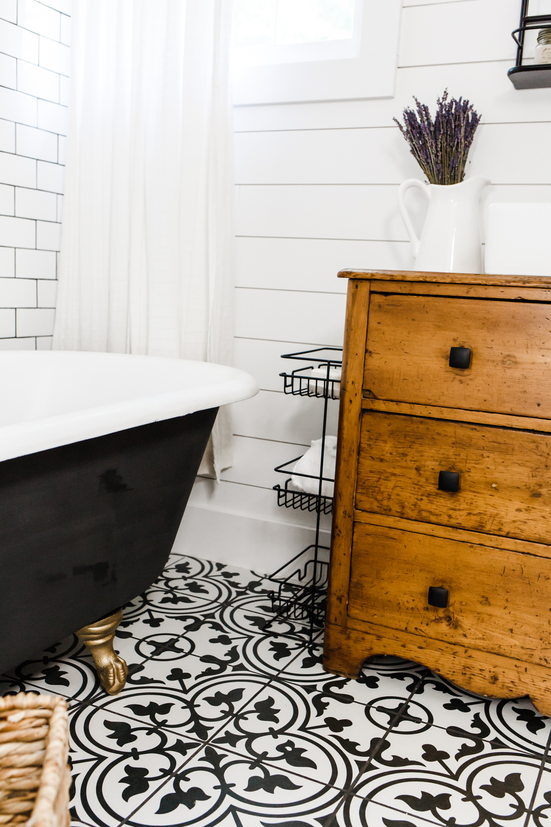
I fell in love with this tile 2 years ago and all along it has been my plan to use it in this bathroom. I am so happy with it. It’s beautiful and makes such an amazing statement, and just feels so pretty and classic. I love the pattern and the clean color. The charcoal is nice and deep but not too flat and it’s a good matte tile. I was a little worried about going with such a bold pattern, but I could not be happier with it. And I’m so glad to finally have tile in the bathroom again.
Vanity:
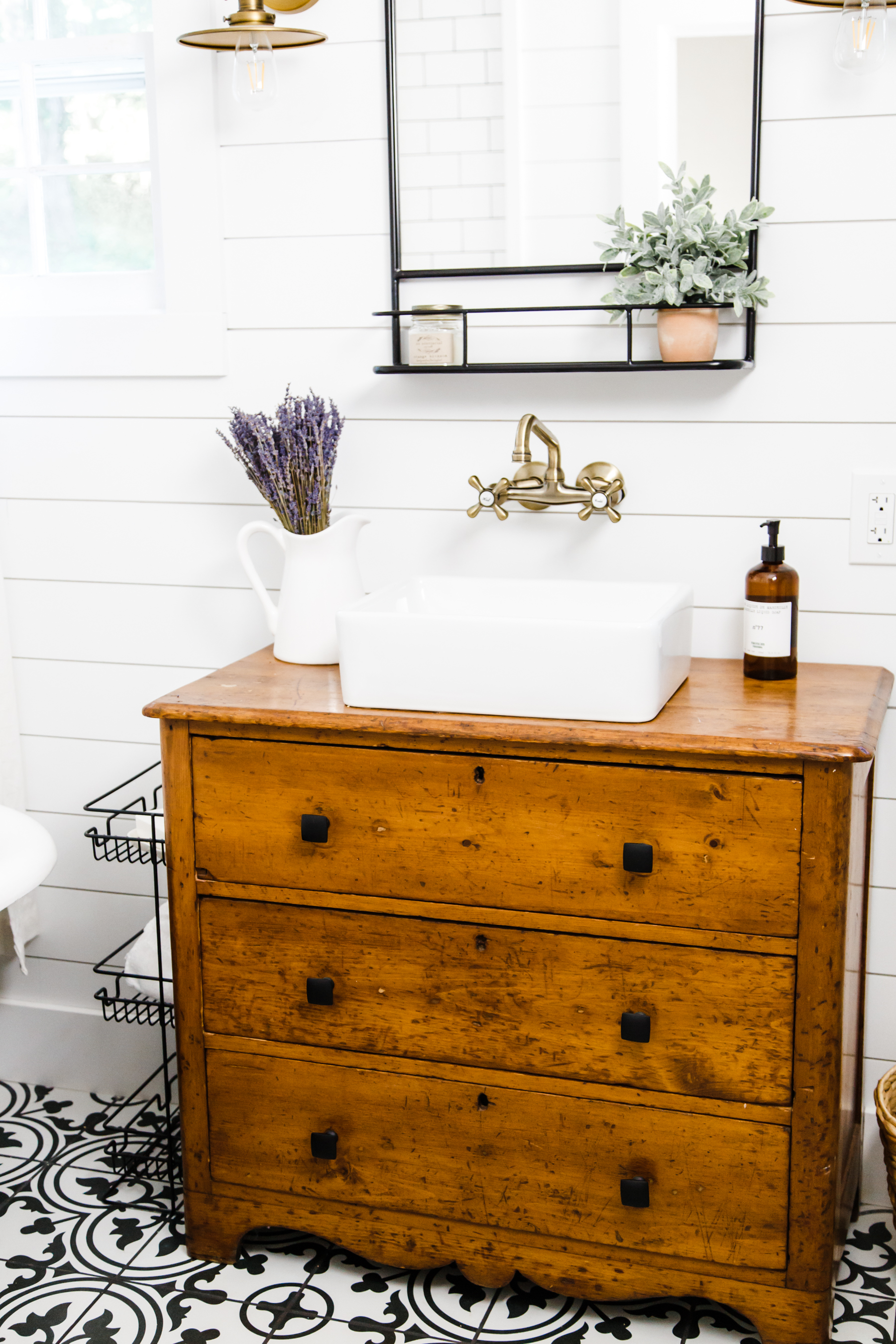
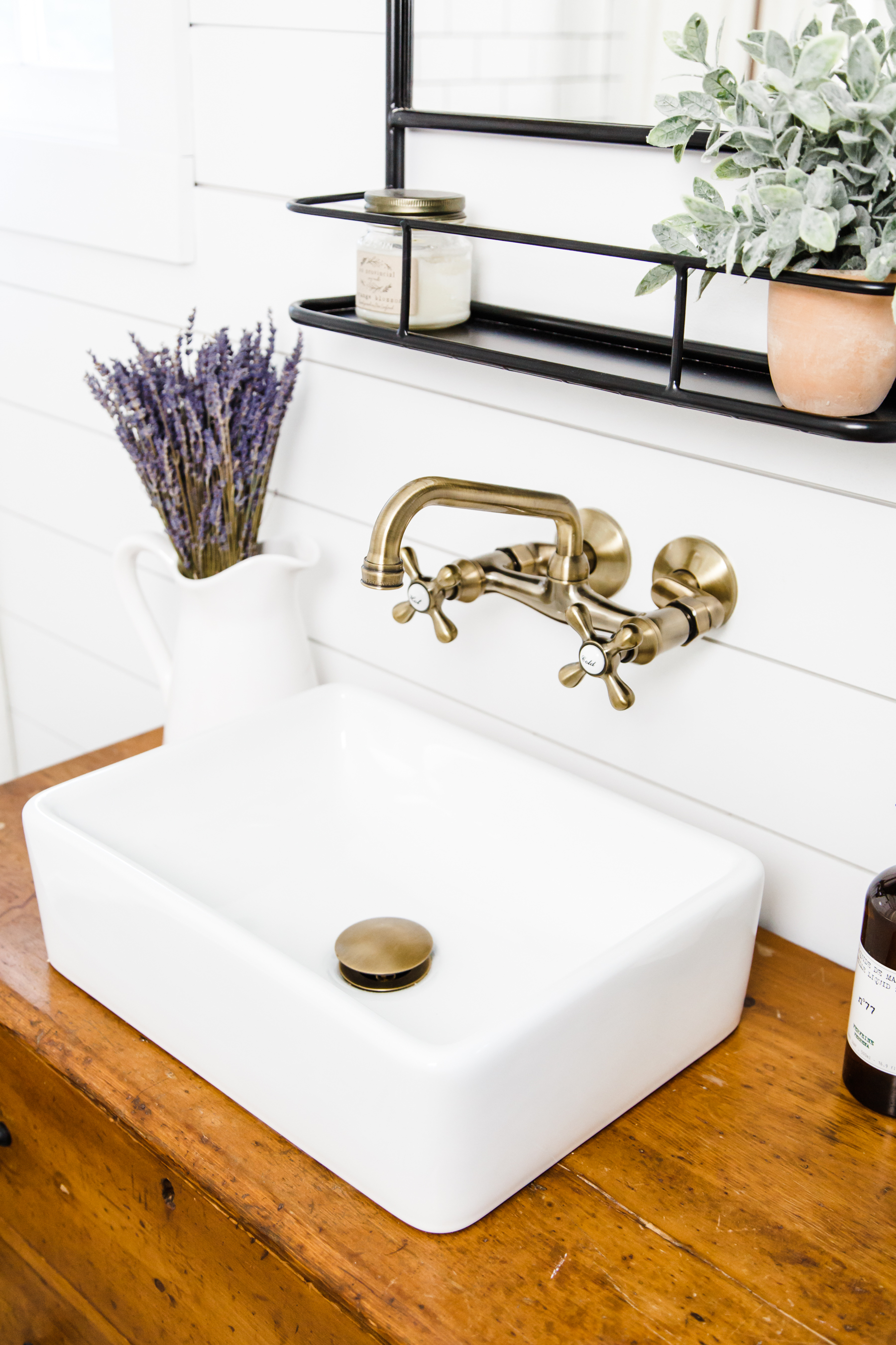
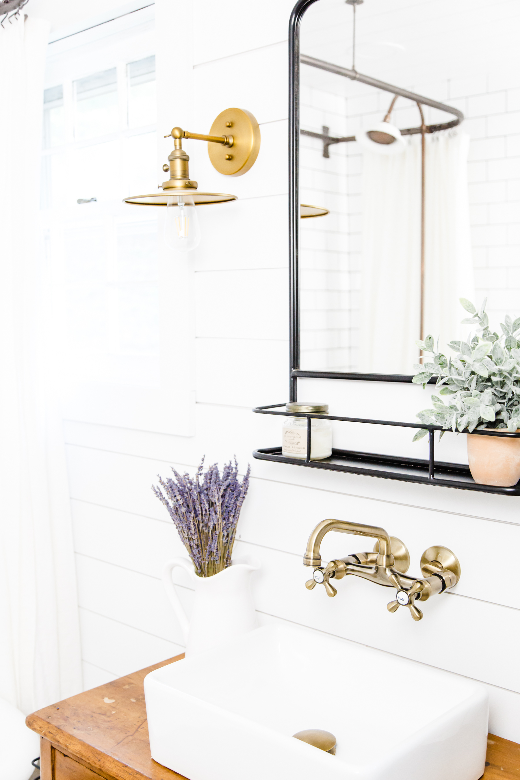
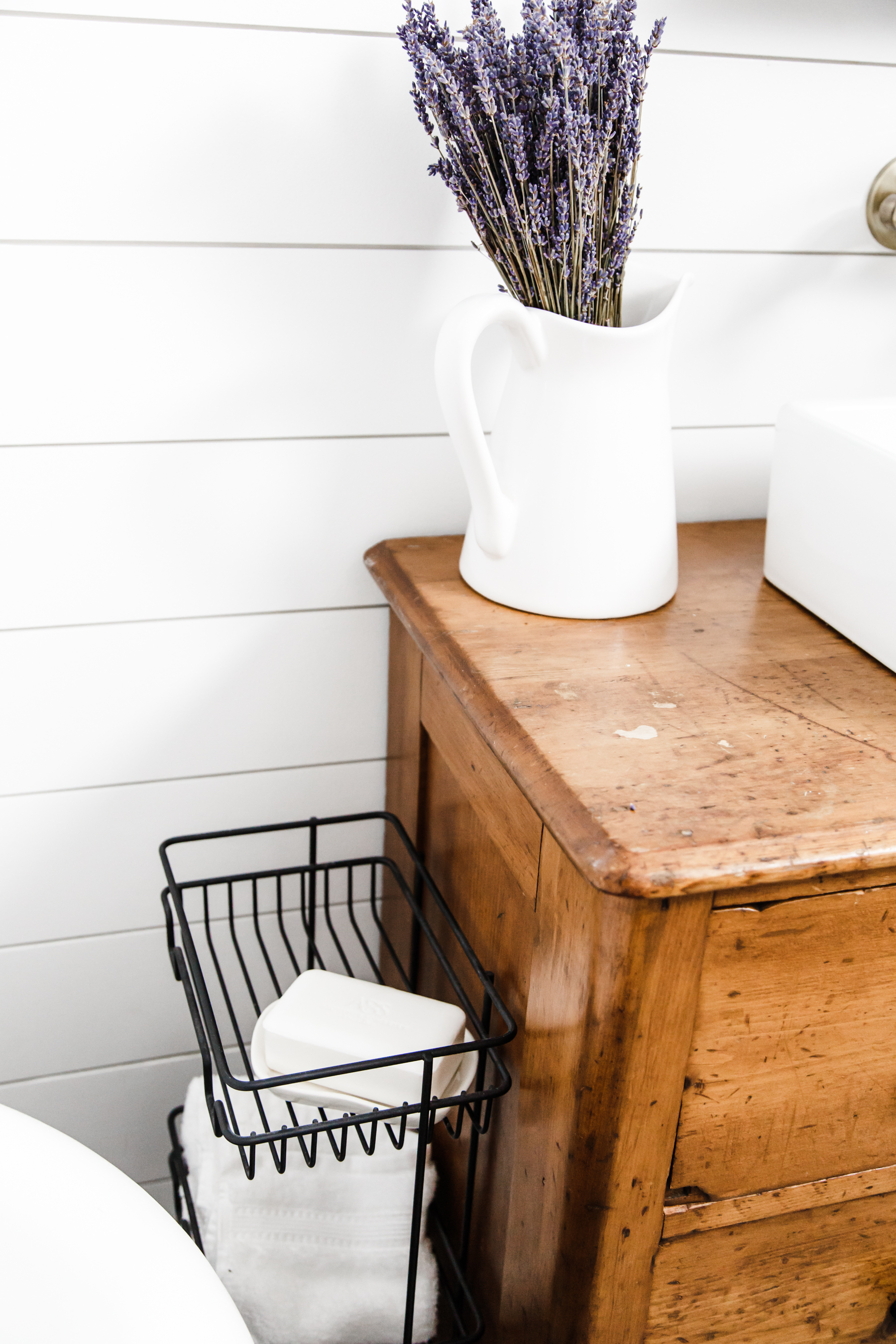
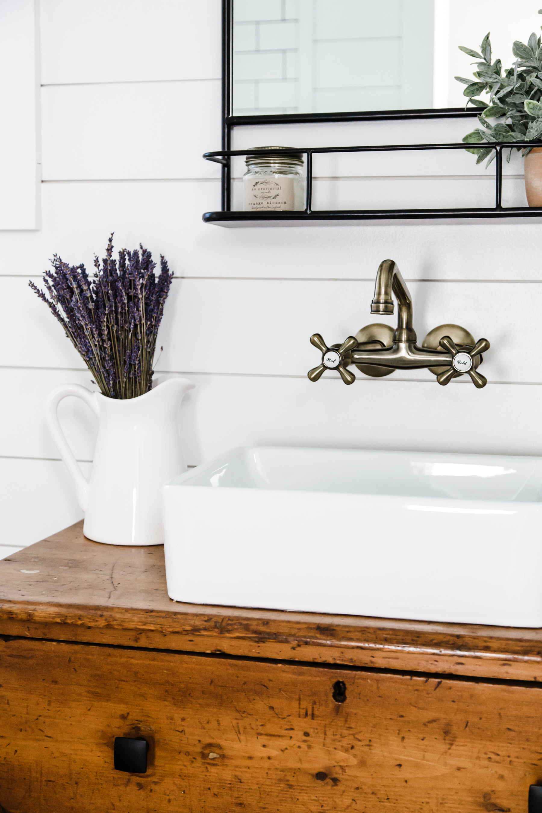
When we reconfigured the bathroom we decided the best place for the vanity was between the two windows. It’s amazing how much better the space flows now. I really wanted to bring some nice wood tones into the bathroom and I knew I wanted to do it with the vanity. So I started searching for the right antique dresser. My requirements were: something small enough to work in the space (but not too small), a true antique piece, warm wood tones, a great patina and lots of distressing, something simple but with a structure and style that fit the style of the room. I found this dresser at an antique shop on the shoreline after weeks and weeks of searching (and scouring Brimfield…) I love it, and it is perfect in the space, and adds so much warmth and texture to the room. I replaced the old wood knobs with these flat black modern pulls. I wanted to give the piece a fresh feel. We had to rebuild the inside of the drawers to accommodate the plumbing, and also a hole needed to be cut in the top and the vessel sink attached. We didn’t want to encumber the top of the dresser so we went with a wall mounted faucet. We chose this one from Kingston and Brass and I love it. The quality is amazing.
The tub:
I knew from the beginning that I wanted to do a clawfoot tub in this bathroom and that I wanted it to be a genuine cast iron antique clawfoot tub. It took a lot of searching before I finally found this amazing clawfoot tub at a flea market. It was cast on July 14, 1924, right here in the U.S. When I found it, it was a diamond in the rough. It had probably 10 layers of old paint on the outside and the inside needed to be completely refinished. I stripped down the outside paint using a chemical stripper, one layer at a time , outside in the hot New England summer heat, with a respirator mask on. It was literally the worst job of my life and very messy. But it worked! Then I repainted it with this gorgeous chalk paint in the color toasted poppyseed (it matches the floor perfectly!). After that I got to work on the inside of the tub. The surface needed to be thoroughly scrubbed and scoured, then I patched the spots where the porcelain had chipped using Bondo (that was an experience!) and refinished the whole surface. We also ordered new reproduction feet (one of the old ones was broken) and I refinished them in an antique brass. Not a simple process, but it turned out beautiful and I love our genuine clawfoot tub.
The Door:
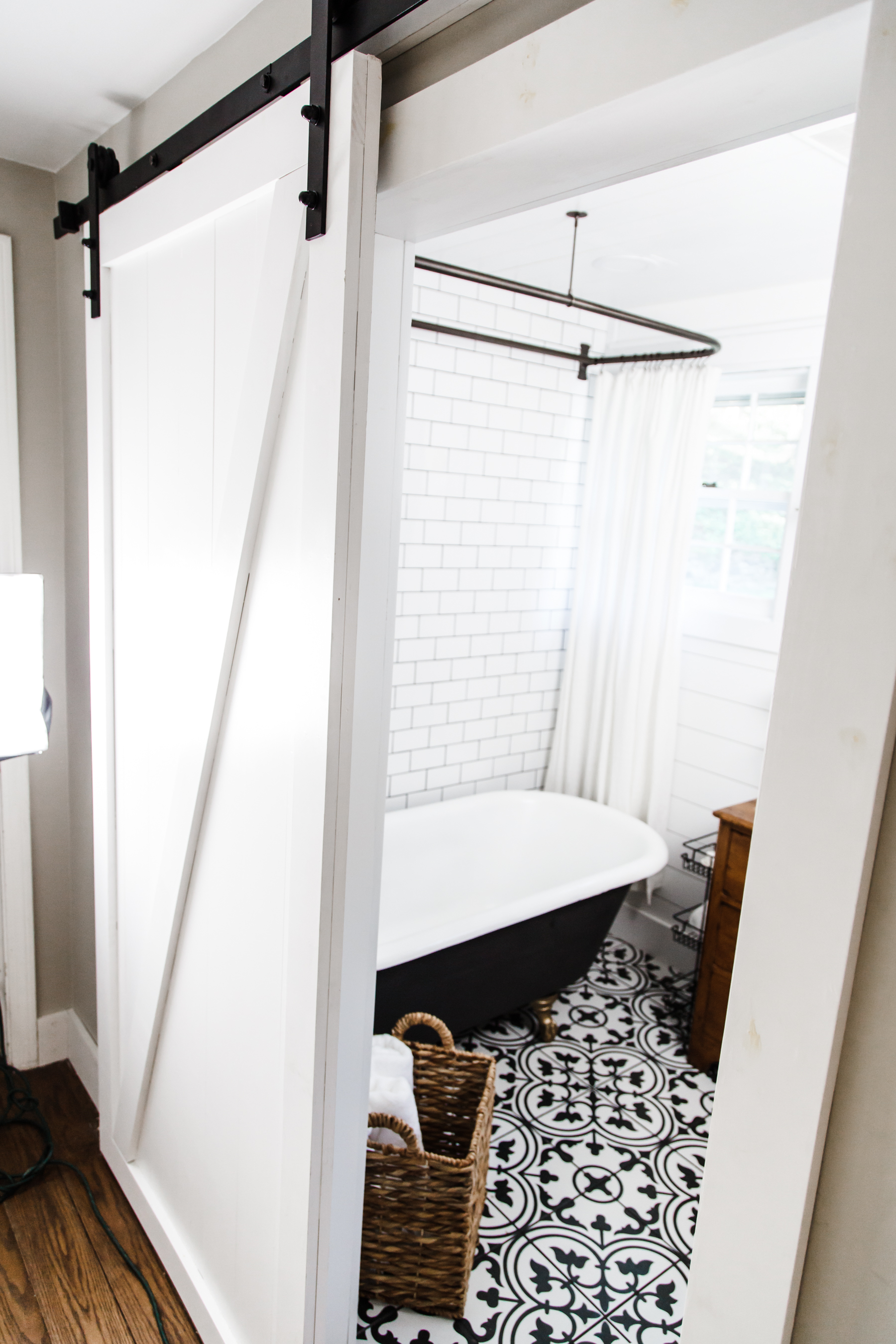
We decided to totally reconstruct the door situation and opted for a sliding barn door rather than one that swung in, this would optimize the space and not encumber the room at all. Craig built the door using primed pine and I painted it the same white as the rest of the room. I love the way it turned out. We still need to add the handle and lock (rule is, if the door’s shut it’s in use) which we have but just haven’t put up yet. Here’s the link to the slider hardware.
Tub and Shower hardware:
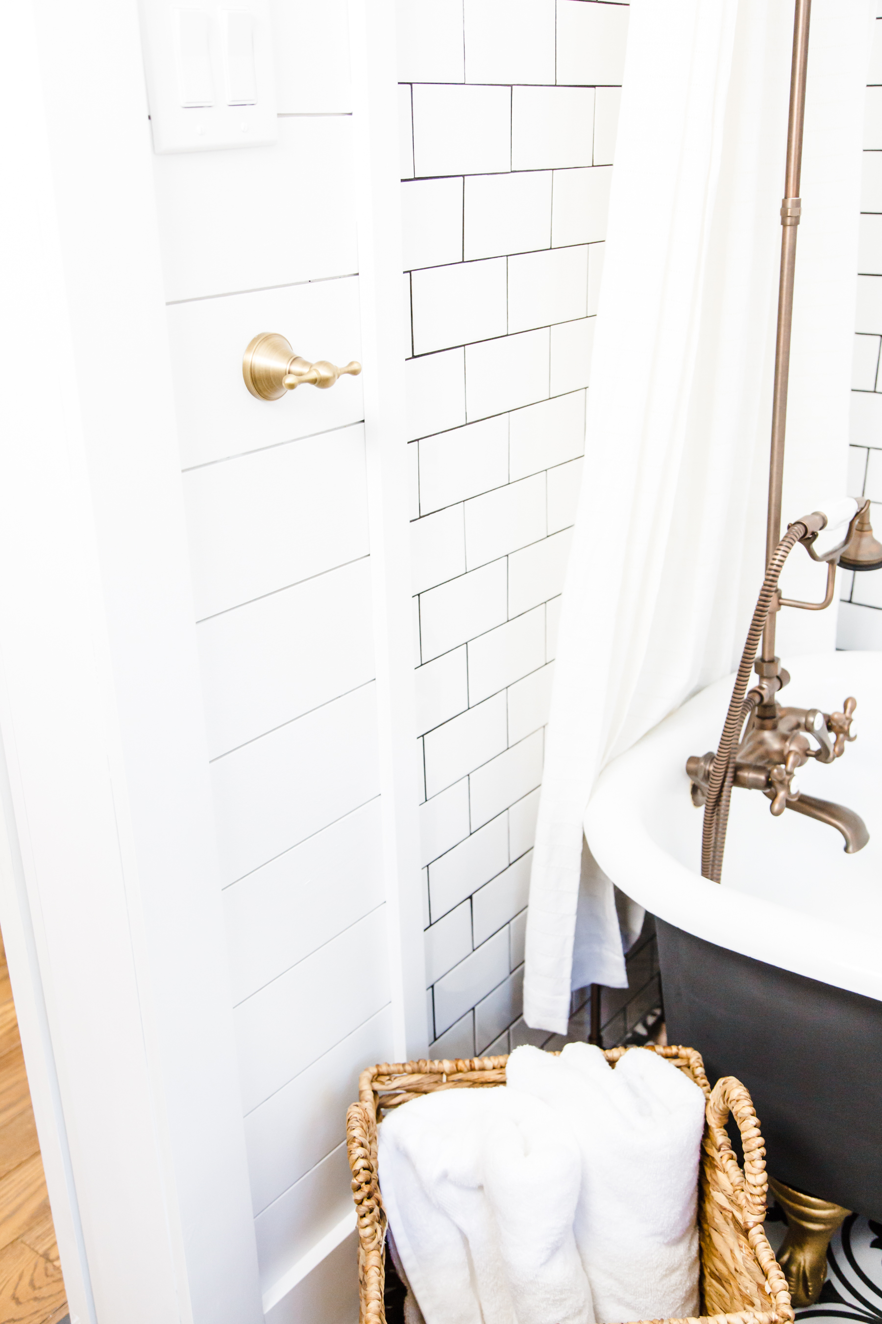
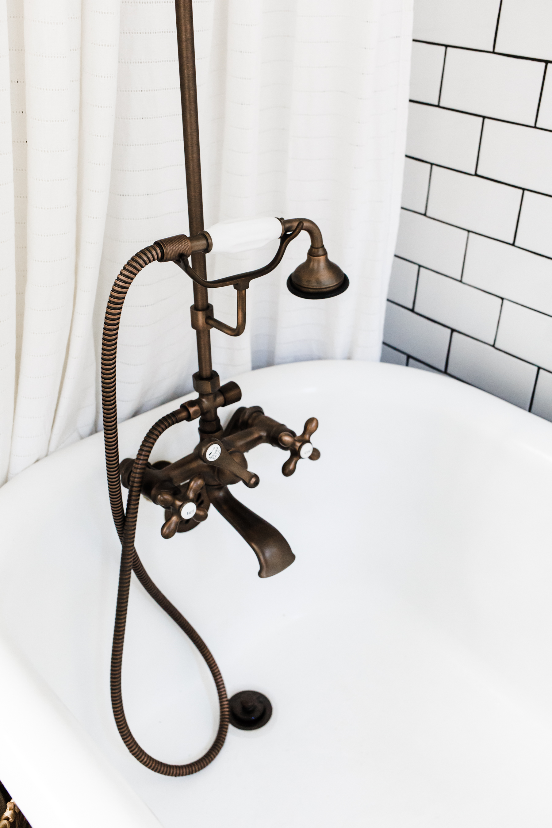
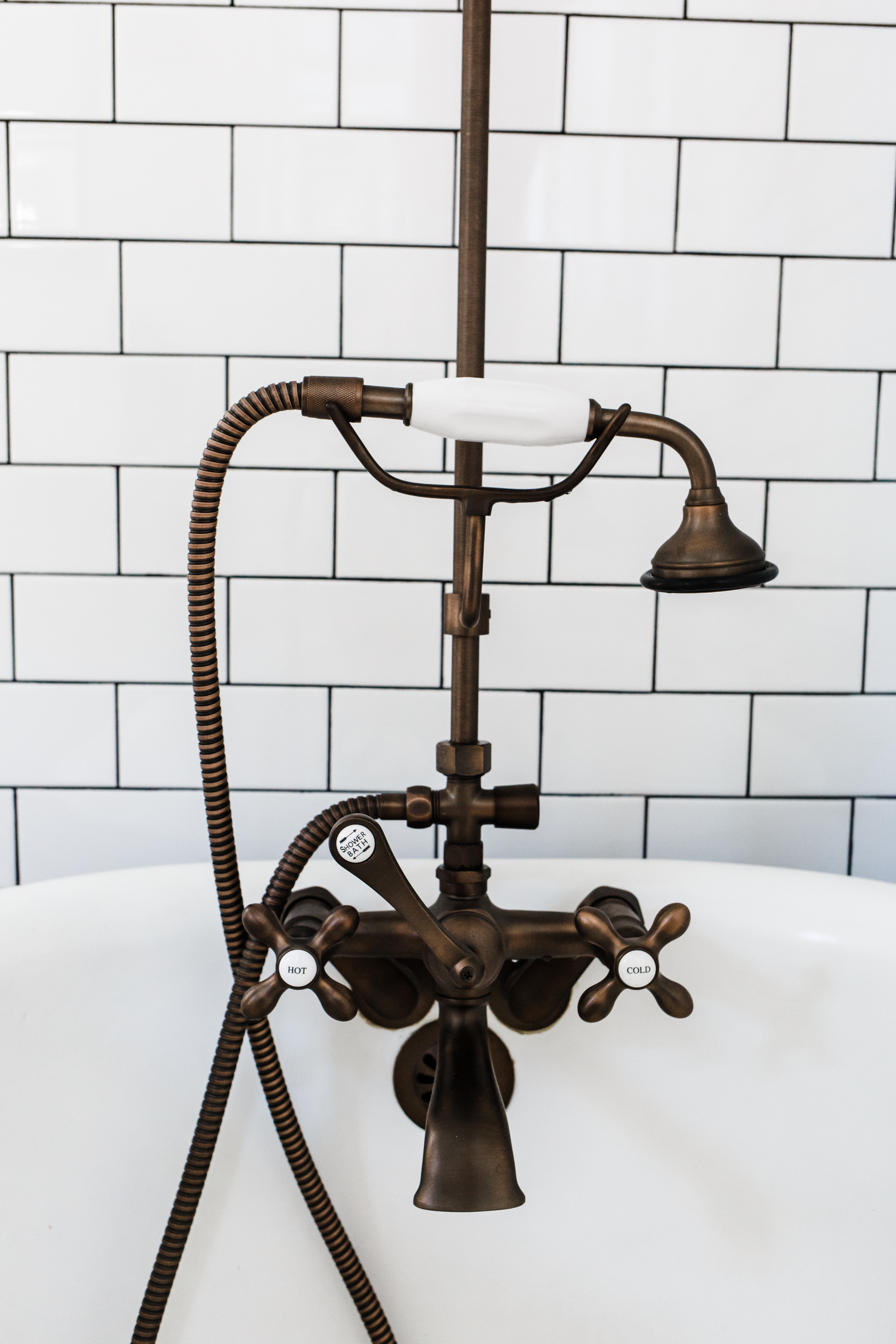
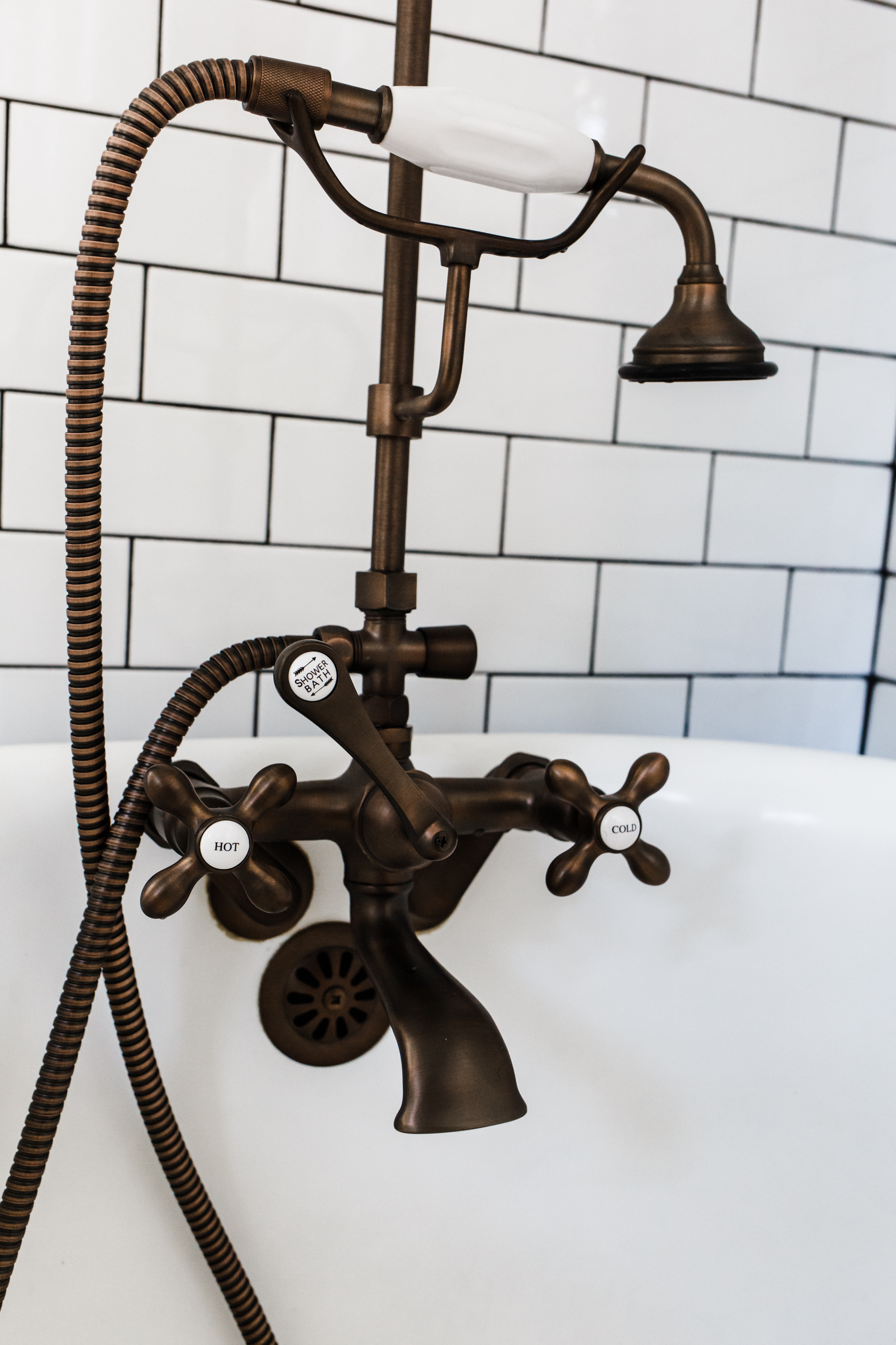
With a tub that makes such a statement I really wanted to find a beautiful hardware set that fit with the style and era of the tub. Because our tub is a genuine antique, it was very difficult to find the perfect tub/shower hardware in the style I wanted that actually fit the holes and design of our tub. I searched high and low, to find the right pieces and that’s when I found Signature Hardware. I am going to write a whole post on the set we chose and why, on the brand and the experience of getting it all put together, but let me just say, this is the most beautiful shower/tub faucet I have ever seen and I literally want to pinch myself everyday when I’m taking a shower. More on this later…
Accessories:
I wanted to keep it pretty simple in this space because it is a working bathroom for a family of six and I don’t like clutter so I just added some greens from HomeGoods, a lavender bunch and a few pretty pieces around the space to add life and texture. I found the wall décor at an antique shop, the artist who builds them uses reclaimed barn wood, and I just love it.
Okay, there you have it! Our new modern farmhouse bathroom! Links to all the products are below, if you have any questions, feel free to ask and I will answer!

Floor tile: Home Depot.
Subway tile: Home Depot.
Shiplap: these boards.
Vanity: vintage dresser (found at a local antique store).
Drawer pulls: Home Depot.
Vessel sink: Amazon.
Vanity faucet: Kingston Brass.
Sink drain: Amazon.
Wall sconces: Amazon.
Slim ceiling can lights: Home Depot.
Pharmacy mirror: Target. (also love this one and this one.)
Clawfoot tub: vintage (found at a flea market). Similar here.
New clawfoot tub feet: found on Ebay.
Tub and shower hardware: Signature Hardware. (c/0)
Towel bar/toilet paper hardware set: amazon.
Led Edison Bulbs: Amazon.
Sliding barn door hardware: Amazon.
Sliding barn door floor guide hardware: Amazon.
Barn Door Lock: Amazon.
Barn Door Flush pull: Amazon.
Wall paint: Sherwin Williams line (at Lowes) color is “Ultra White”
Tub paint: Kilz Chalk paint line, color is “Toasted Poppyseed”
Shower curtain rings: Walmart.
Free standing shower caddy: Target.


Wow it looks fantastic. I just love how the tile, tube and vanity work together. And all the little finishing touches are perfect.
Absolutely stunning! I couldn’t love it more! What a treat after the hard work and long wait!!
The remodel looks amazing!! And I love that you used an antique dresser as a vanity!
http://www.rdsobsessions.com
This. looks. a m a z i n g. Craig and you put in so much work. I find it interesting and impressive that he read the plumbing code book. So for the bathroom vanity made from a dresser, which drawers are functional? Is the top used for toiletries or is it reserved for pipes? How about the middle and bottom drawers? So on which wall did the vanity stand before the remodel? Was the vanity standing by the wall where the reclaimed wood arched decorative piece is now?
I would love to know how you refinished the inside of your tub. I have an antique one, as well, that really needs some love on the inside! What products did you use on the inside and would you recommend it to others or recommend hiring a professional to refinish? Gorgeous bathroom, from top to bottom! ❤️