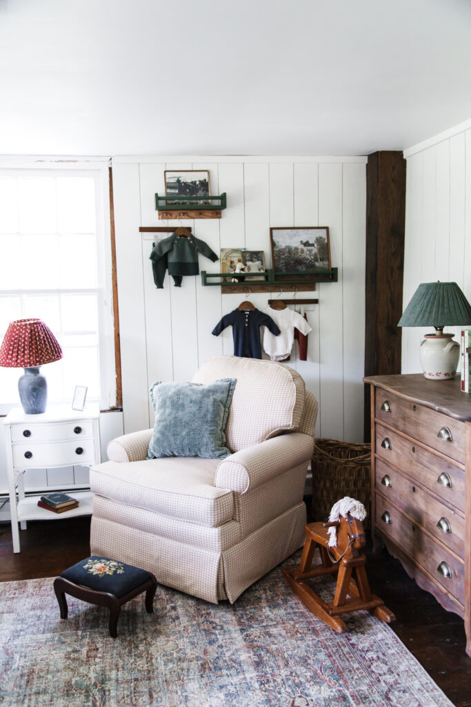
Finn’s room has been the room of many uses since we moved into our house. It started as Hannah’s room and then when Ava was old enough, we moved them into the same room to share and it became a dedicated guest bedroom and office for me to work in. Last year when I found out I was pregnant with Finn, the room went through another change. Now its a combined nursery for our darling babe and guest bedroom for the occasional out of town visitor. It’s large enough for a crib and a full size bed with makes it ideal for a multi-use room, and it turns out I actually love having a bed in there for those long nursing nights. But more on that another time…
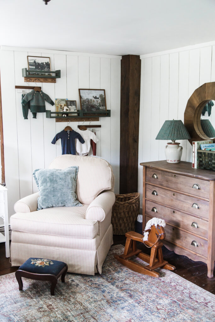
The trick I’ve found with designing multi-use spaces is giving them the right feel, without making them too bland since they have to do a lot. I didn’t want this space to be too kids-y or juvenile, but I did want it to feel cute and homey. I wanted it to feel classic and be a space that could grow with Finn. I mostly focused on mixing textures and prints with florals and plaids, and adding pops of deep greens, and rich wood shades. The space is still in progress, I’ve got trim on the window to finish, and window coverings to choose, bit we are slowly getting there with this little combination nursery and guest bedroom.
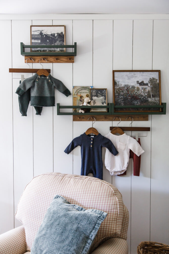
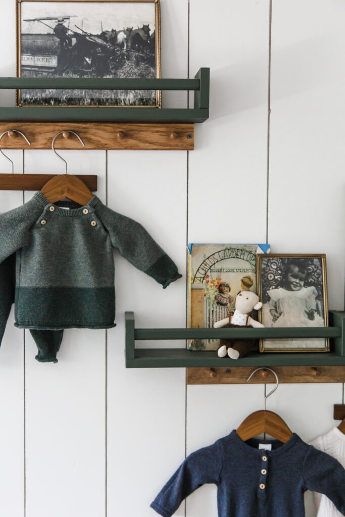
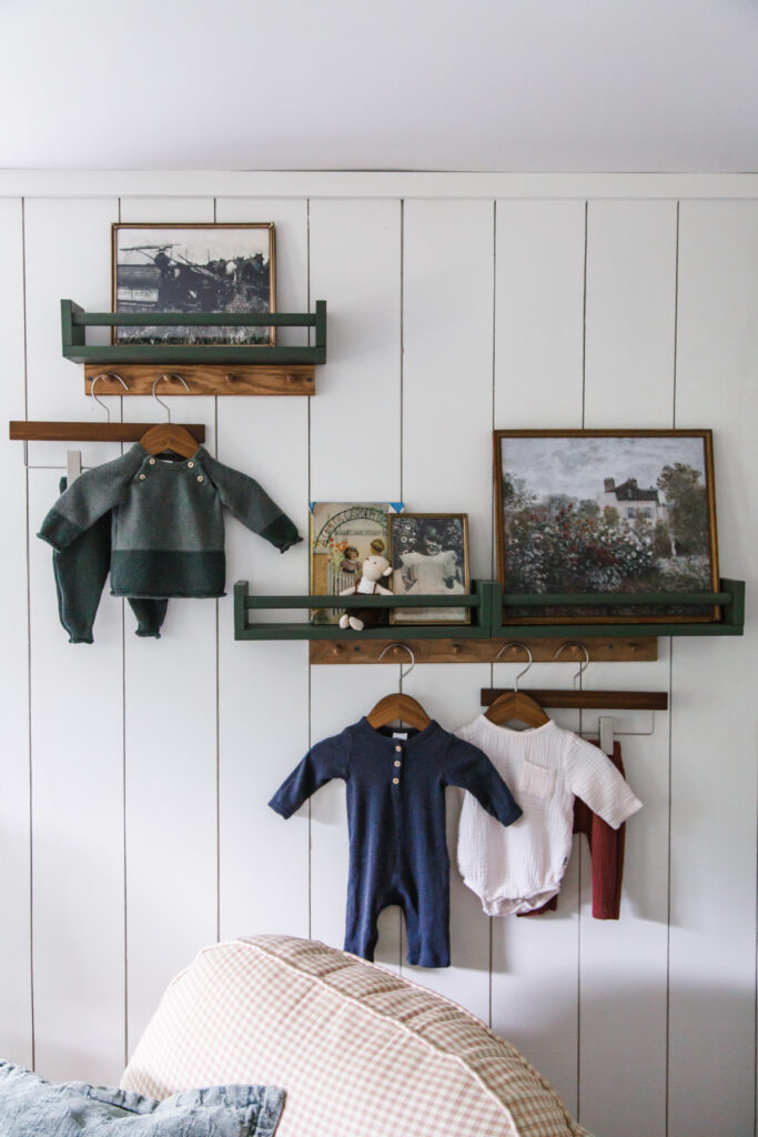
I did want to create a corner in the room that was exclusively for Finny, and made it feel like a baby’s room without being too cutesy. I also wanted to break up the art and add a little more texture to the room’s walls, so I put together a little nursery vignette in the corner. Vignette’s are a fun way to create more personality in a space beyond art, and I think they are just perfect for a kid’s or baby’s room. Here’s how I did it.
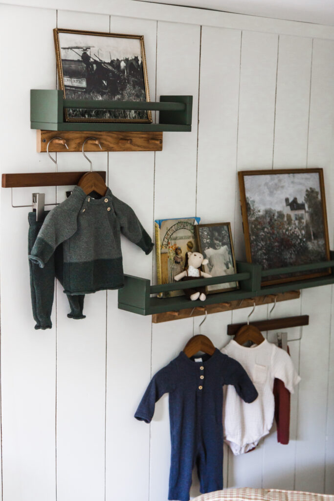
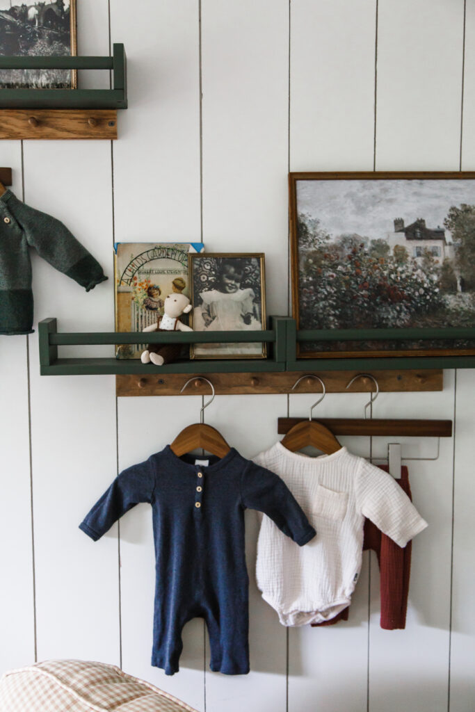
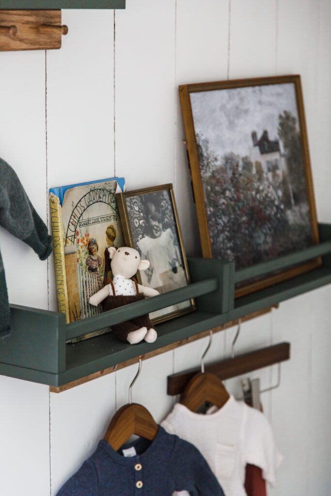
First up I started with these spice rack shelves. They’re the perfect size and are easy to double up, and the little bar on the front make’s it easy to display items and pictures. I knew I wanted to have a double shelf on the bottom and one off-set on the top. I painted the shelves “vintage vogue” from Benjamin Moore. It’s the same moody green I painted the crib and bed, and it’s a beautiful color. Painting the shelves this color tied the whole room together more cohesively, but the shelves come raw so they can also be stained. Find these and similar rack shelves below:
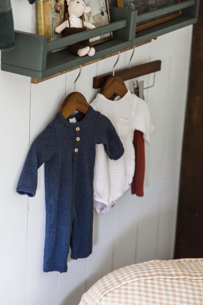
Below the shelves I added some racks with knobs that I stained the same color as Finn’s dresser. Now, we’re ready to decorate.
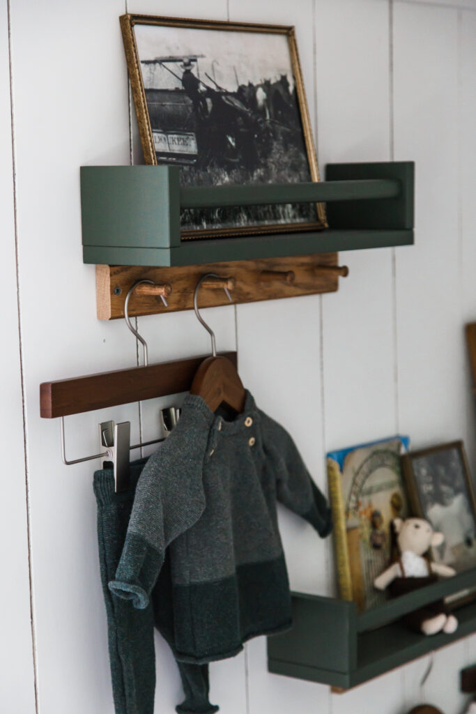
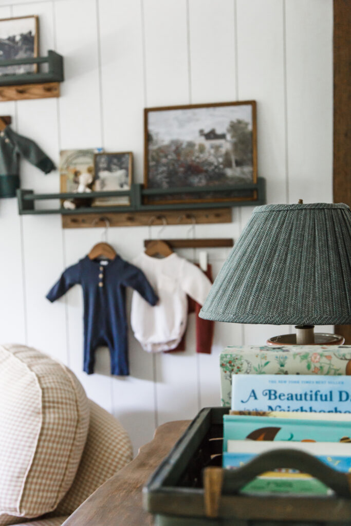
I wanted the vignette to feel collected and personal to Finn. I stared with 3 vintage frames in different sizes; I filled one with a pretty vintage art print, and the other two with black and white photos of my Grandpa when he was a child. Finn’s middle name is after my grandpa so I wanted something in the space to remind us of him. On the shelf I also placed a vintage book of Robert Louis Stevenson children’s poetry I found in an antique shop years ago. (My mom used to sing many of his poems to me and my siblings growing up so it’s a special book.) And I also added a sweet little stuffed animal I found for Finn in a shop in Maine while I was pregnant last fall.
From the racks I hung some of my favorite of Finn’s newborn outfits on these darling little hangers. I love that I can preserve and display them, especially because they have really happy memories, and it really helps the room feel a little more whimsical for a little one.
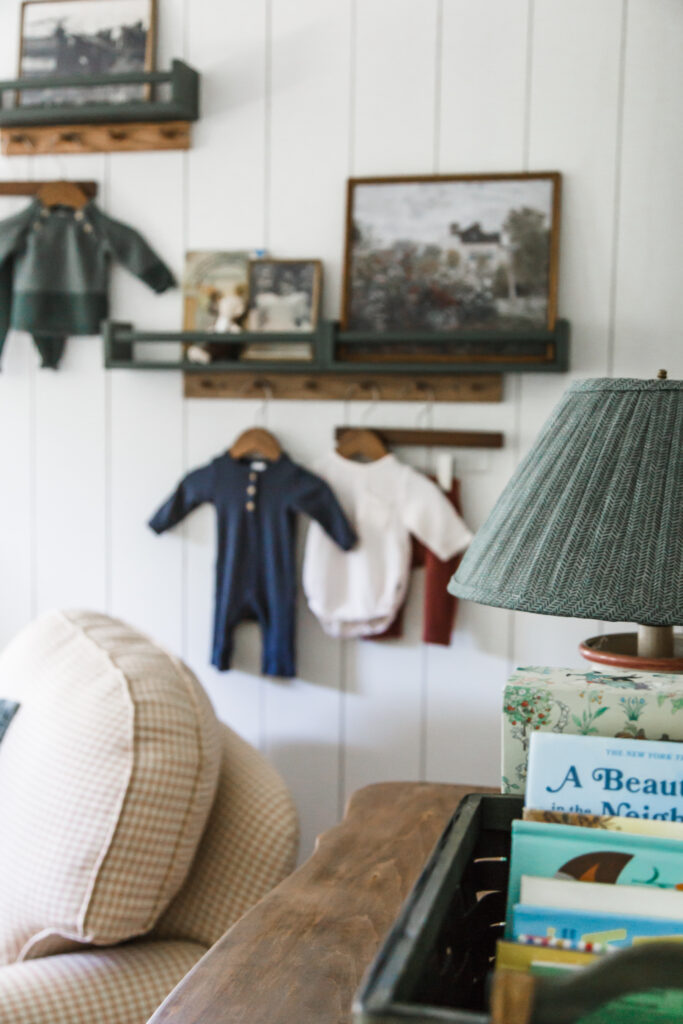
That’s how I put together Finn’s vignette in the nursery. I like that we can switch things up and change things around over the years as he grows!
See how to make a vintage art print look like an original here.
How to transform thrift store frames into vintage art.
